I am not sure, but I can't help being suspicious. 5ym5, your "cousin" Has favorited you as an author, and faved your boxes, and one of lenny's. Nothing else. Yet, he seems to know so much about how you are getting better (which I agree with, the front it awesome!). So, don't take it to hard, but I am sort of suspecting 5ym5 of being an alt-account. Aside from that, nice box, but the back seems too cluttered. 3.5/5
Vidboy10 you should tell your "cousin" to play it down a bit because if he is only on this site to fav your boxes and give you encouraging comments and nothing else, i'm sure Reed will have something to say about that.
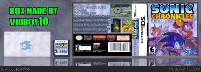
Anyway about the box, this is by far your best box yet! It does look sorta official although I dont think that DS with the Sonic face on it was needed. The back does look pretty messy though, way too much text! Remove some of the text on the back and maybe change the layout a bit and I may consider faving this.
Nice going :) 4/5
Thanks Guys and no 5ym5 is not my alt he's my cousin =) and id never make alts to fave my own boxes =) he's here just t favorite boxes and comment them =)
Crap, I was thinking of doing a box with that exact image today, but you beat me to it. Event hought it's just an image on the front, it looks awesome. Good job! +fav
 Sonic Chronicles: The Dark Brotherhood Box Cover Comments
Your best. Period.
There's too much text on the back, and the logo on the spine is messed up, but that's about it.
Edited at 1 decade ago
[ Reply ]
This Took awile i hope my effort pays off ^_^
Credits:
Koopa Dasher For the temp
and Master_General For The Cut out Logo
[ Reply ]
#1, Wow! That Was Quick =P
anyways Thanks ^_^
[ Reply ]
nice box you are getting alot better and i really mean that {favorited}
Edited at 1 decade ago
[ Reply ]
#4, Thanks Cousin =)
[ Reply ]
I can't see a lot of effort in this, since this is your third submission today.
Edited at 1 decade ago
[ Reply ]
#6, i had the psd file on my pc but i never got to finish this so i decided to finish this today
[ Reply ]
#7, but did M_G just submit his logo like today?
[ Reply ]
#8, yesterday acutely
Edited at 1 decade ago
[ Reply ]
I am not sure, but I can't help being suspicious. 5ym5, your "cousin" Has favorited you as an author, and faved your boxes, and one of lenny's. Nothing else. Yet, he seems to know so much about how you are getting better (which I agree with, the front it awesome!). So, don't take it to hard, but I am sort of suspecting 5ym5 of being an alt-account. Aside from that, nice box, but the back seems too cluttered. 3.5/5
[ Reply ]
Awsome!!!
[ Reply ]
Vidboy10 you should tell your "cousin" to play it down a bit because if he is only on this site to fav your boxes and give you encouraging comments and nothing else, i'm sure Reed will have something to say about that.
Anyway about the box, this is by far your best box yet! It does look sorta official although I dont think that DS with the Sonic face on it was needed. The back does look pretty messy though, way too much text! Remove some of the text on the back and maybe change the layout a bit and I may consider faving this.
Nice going :) 4/5
[ Reply ]
Edited at 1 decade ago
[ Reply ]
Thanks Guys and no 5ym5 is not my alt he's my cousin =) and id never make alts to fave my own boxes =) he's here just t favorite boxes and comment them =)
[ Reply ]
I really like the look of this
fav
[ Reply ]
It looks alright,Too much text on the back.
[ Reply ]
Eh, pretty cool but too much text on the back
[ Reply ]
Crap, I was thinking of doing a box with that exact image today, but you beat me to it. Event hought it's just an image on the front, it looks awesome. Good job! +fav
[ Reply ]
thanks for the comments guys ^_^
[ Reply ]
Edited at 1 decade ago
[ Reply ]
MY GOD 6 FAvS?!?!?! One more than it will be my most favorite box =D
[ Reply ]
#21 Love to be nice ;)
[ Reply ]
#22, OMG thanks dude ^_^ anyone else? =D
[ Reply ]
#23 Like i said, I will fav it if you sort the back out.
[ Reply ]
#24, I'll do that latter. I may redo the whole back if posibal to make it look nice
[ Reply ]
#25, Also, you should move the logo down on the front so it isn't touching th templae and make the logoon the spine smaller.
[ Reply ]
#26, nah I'll just keep the front and the spine the same I'll just do the back
[ Reply ]
Vidboy, you did it. +fav +AUTHOR FAV
But, first... Tell me where you got that amazing artwork!
Edited at 1 decade ago
[ Reply ]
#27, But, you HAVE to fix those things, they're annoying. >.<
[ Reply ]
#27, that's laziness.
[ Reply ]
#28, i went to the offical website and I clicked prt scm on my keyboard and croped it in photoshop
Edited at 1 decade ago
[ Reply ]
no more comments eh? -.-
[ Reply ]
*sigh* Y_Y
[ Reply ]
wow, people love my logo ^^
[ Reply ]
#34, Uh...sorry to burst your bubble, but, like one person talked about your logo, and that was to give credit.
[ Reply ]
Why are you guys bumping this!?!?!?!?!?! >=(
Jk =P
anyways thanks guys =)
[ Reply ]
cool
[ Reply ]
Marker's is better.
[ Reply ]