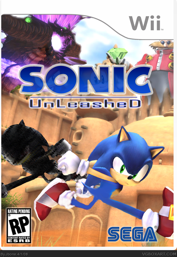
My best box. I wanted to make a really good box, after seing solardestruction's HOF. The black sonic and dragon monster are all mine, and the logo is also. I got other renders from Google and Planetrenders.
They're a few hidden things on this box, 3 to be exact, so try and find them! please rate. I'm making a back soon...
This surprisingly ain't that bad! Its prob the best Sonic Unleashed box on the site (so far) and it seems you made a real effort with this rather than just slap some Sonic renders on a random background. Nice job!
Although im not too keen on the Sega logo. Find one with a white outline and move it nearer the right as it may look better.
Anyway overall 4/5
#16 there's only one problem with that. I have one outlined logo, but it's in Index form and it has the locked symbol next to it. When I click the the layer, nothing happens. (I use Photoshop 7.0)
ZSorry, JBone, i dont like it. It shouldn't be "RP" and the logo is really blurry but tails and knuckles IS a nice effect. Sonic's running in the air, i guess because there's Zero gravity, and the black sonic in the back looks bad. 3/5. Nice try though.
#28 actually, I tried blending in a ground. I guess it's to transparent...
Sorry, but you lost me at the logo part. It doesn't look blurry at all... maybe that's because I had an outer glow added? Thanks for the Constructive criticism though.
#32, you have to remeber this was made before an official rating for the game came out. He had all right to put it there, and what he probably meant is only use it when no rating exists.

 Sonic Unleashed Box Cover Comments
My best box. I wanted to make a really good box, after seing solardestruction's HOF. The black sonic and dragon monster are all mine, and the logo is also. I got other renders from Google and Planetrenders.
They're a few hidden things on this box, 3 to be exact, so try and find them! please rate. I'm making a back soon...
[ Reply ]
Is this a real game?
[ Reply ]
#2, yeah it looks awesome dose it? =D
[ Reply ]
#2 it's real.
Thanks so far.
[ Reply ]
Ooo I can't wait!
[ Reply ]
i see tails and shadow in the logo, nice effect there
[ Reply ]
#1, Awww I'm honored, lol. No, but seriously, this is a great box. 4/5!
[ Reply ]
nope not Shadow, it's knuckles GFX!
#7 4/5? Something wrong?
[ Reply ]
#8, whoops my bad
[ Reply ]
#8, Dark Sonic looks a bit funky and out of place.
[ Reply ]
I might be able to change that, if it makes people fave!
any better now?
Edited at 1 decade ago
[ Reply ]
the emerald in eggman's hand is a nice effect
[ Reply ]
#12, thanks, if you notice, the FINAL secret is that the emerald is positioned just above the "I" in Sonic!
[ Reply ]
coolz
[ Reply ]
you are great man!!!!!!!!!!!!!!
love it!
[ Reply ]
This surprisingly ain't that bad! Its prob the best Sonic Unleashed box on the site (so far) and it seems you made a real effort with this rather than just slap some Sonic renders on a random background. Nice job!
Although im not too keen on the Sega logo. Find one with a white outline and move it nearer the right as it may look better.
Anyway overall 4/5
[ Reply ]
Kool, fav'd
[ Reply ]
#16 there's only one problem with that. I have one outlined logo, but it's in Index form and it has the locked symbol next to it. When I click the the layer, nothing happens. (I use Photoshop 7.0)
[ Reply ]
#18, I use the exact same program
[ Reply ]
Photoshop is weird. The cutting is
really frustrating, plus I don't
even have the right kind.
[ Reply ]
#20 just use the background eraser tool. And thanks for the faves everyone, I hope this box keeps gettin' them!
[ Reply ]
Did you get the Sonic pic from SSBB?
[ Reply ]
#22 yeah
[ Reply ]
Wow...If only it were real.
I give it a 5/5!
wait a sec....that is a real game.
Edited at 1 decade ago
[ Reply ]
#24 thanks code. Always appreciate 5/5s!
[ Reply ]
Updated one more time. Better dark sonic.
[ Reply ]
#26, Way bettr
[ Reply ]
ZSorry, JBone, i dont like it. It shouldn't be "RP" and the logo is really blurry but tails and knuckles IS a nice effect. Sonic's running in the air, i guess because there's Zero gravity, and the black sonic in the back looks bad. 3/5. Nice try though.
[ Reply ]
#28 actually, I tried blending in a ground. I guess it's to transparent...
Sorry, but you lost me at the logo part. It doesn't look blurry at all... maybe that's because I had an outer glow added? Thanks for the Constructive criticism though.
Edited at 1 decade ago
[ Reply ]
Not bumping, but I'm going to make a new version of this box soon. It will be posted seperately.
[ Reply ]
100/100
[ Reply ]
looks good, but you told me on one of my boxes to never put RP, and there's an RP on your box. lol.
[ Reply ]
#32, you have to remeber this was made before an official rating for the game came out. He had all right to put it there, and what he probably meant is only use it when no rating exists.
[ Reply ]
i was just playing around man. no offense.
[ Reply ]
cool idea for the cover!
[ Reply ]