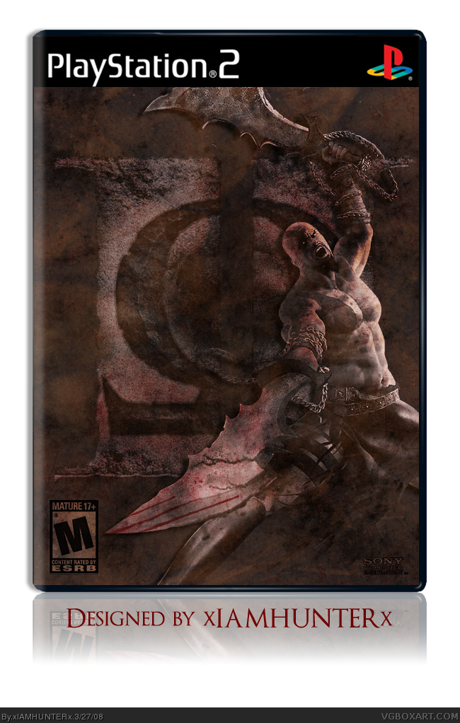
If this were one of those collector's edition thingies that have the sleeves with the logo and stuff on it, then it would make a bit more sense for the absence of the logo.
But as it stand, you're right, it looks cool. :P
Great job.
And for the record, please don't anyone rate it low or don't fave it just because "there's no back". If you like it and think I did a good job, please tell me so.
Back'd. Yes, I know it's plain. There's a reason: If you're going to shell out the extra cash for the CE of this game, you pretty much know what to expect.
I will forever bump this box. -___^
I love the blending and recoloring of the images. This box deserves to be in the Hall, as it is what #29 said.. "Perfect."
#45- Yep, it's your opinion. And mines the opposite. I actually love the simplicity with "THE END BEGINS..." being the only text, as it adds suspense and makes you want to open the tin.
what? i'm not trying to be a goody two-shoes or anything. but a lot of these comments are bumps. #47, #40, #38, #36, #34, #32, #30. "Thank You" posts count as bumps aswell. Please stop it. it's annoying. I know we all like getting comments, but you've had enough and not EVERY box has to make it into the hall of fame. cut it out already, for the love of god.
I'm not trying to get this one in the Hall... I'm quite pleased with the reception it got already. Forgive me, good sir, for expressing gratitude for qwerty's high praise of my hard work. I'll remember that next time I'm tempted to thank someone who likes one of my boxes.
then what's with comments like "Er." three hours after the previous one? Clearly you're trying to get more attention. you can thank people, but don't do it for EVERYONE.
you don't get it do you? I don't give a flying shat whether this got 5 comments or 500 comments. The point is, you're bumping to get extra attention, which you're not supposed to do. It could've been three hours or three weeks, you're still not allowed to bump for extra attention. In case you forgot, #5: link
 God of War II Box Cover Comments
Don't ask why, I said don't.
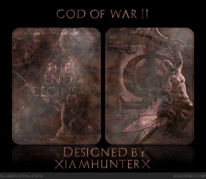
More experimenting. I really like the way it turned out.
Full view.
[ Reply ]
i dont see the logo or the ersb.....
[ Reply ]
This would NEVER be on the shelves. :P
Edited at 1 decade ago
[ Reply ]
link
#3, And you faved it anyway. :p
Edited at 1 decade ago
[ Reply ]
#4, I can't tell if you have Apple or Vista...
[ Reply ]
#5, Vista.
[ Reply ]
If this were one of those collector's edition thingies that have the sleeves with the logo and stuff on it, then it would make a bit more sense for the absence of the logo.
But as it stand, you're right, it looks cool. :P
Great job.
#4, lmao, nice
Edited at 1 decade ago
[ Reply ]
Good idea but it doesn't work.
[ Reply ]
pwnsome---makes a GoW-special edition myself.xD
[ Reply ]
why?
[ Reply ]
#10, Screw you. :p
And happy burfday, by ze way.
[ Reply ]
i quite like it, but it looks like you put a shadow on Kratos... that kinda spoils it for me.
[ Reply ]
A teensy one. It looked weird without it, trust me.
[ Reply ]
#11, Why zank you. But really, this would be amazing if you took of the ESRB and put it on Michael's Tin.
[ Reply ]
*scampers off to update*
[ Reply ]
it's good, but i don't like how you did the logos. i couldn't see this in stores.
[ Reply ]
#16, I could see the main logo like that. I just hate it when people do the ESRB and DEV logos and the temps like that.
[ Reply ]
#17, yeah, that really bothers me too.
[ Reply ]
#17, What did I do to the temp? *confused*
And believe me, I tried the ESRB/Dev logo normally... It looked awful. Clashed horribly with the rest of the box.
[ Reply ]
#19, i guess you're right, but that would probably be better still because no one ever does anything to the ESRB.
Edited at 1 decade ago
[ Reply ]
#19, I meant in general with the temps, not this specifically. And on the ESRB and DEV logos, thats why I just dont put them on CE or SE boxes.
[ Reply ]
I like it, 4/5 because theres no back but it's perty, Ninjamojo Happy Birthday :)
[ Reply ]
Welp... There ya go.
And for the record, please don't anyone rate it low or don't fave it just because "there's no back". If you like it and think I did a good job, please tell me so.
[ Reply ]
sweet as. :)
[ Reply ]
#24, As what?
[ Reply ]
#25, haha
link
[ Reply ]
ahhhh cool.
[ Reply ]
StinkyNelkin removed his fave... I shall haunt him for eternity.
[ Reply ]
PERFECT special edition box.
[ Reply ]
#29, Wow, thanks.
[ Reply ]
Soopoib! Fave.
[ Reply ]
^_______^
*honored*
[ Reply ]
Back'd. Yes, I know it's plain. There's a reason: If you're going to shell out the extra cash for the CE of this game, you pretty much know what to expect.
Minimalist design. :P
[ Reply ]
Er.
[ Reply ]
Delicious.
Mmmmmmmmmmmmmmmmm...
+fav
[ Reply ]
#35, ^_____^ Yay!
[ Reply ]
I will forever bump this box. -___^
I love the blending and recoloring of the images. This box deserves to be in the Hall, as it is what #29 said.. "Perfect."
Edited at 1 decade ago
[ Reply ]
#37, ^_________________________^
[ Reply ]
Hey just noticed this. I like the front cover a lot.
The back is also very good, only thing I don't like is the Kratos render on it - seems kinda random. Still, I can see this being a real cover. :)
[ Reply ]
Thanks DMS!
[ Reply ]
I know that it's a collcetor's ten, and it's supposed to be plain, but the back is plain to a point where it's pointless.
[ Reply ]
Expound, please? There's a lot of brushwork/blending/etc. on the back; I don't see how you think it's "so plain it's pointless".
[ Reply ]
#42, well, for one thing, it doesn't even have the features.
[ Reply ]
#43, Who says there have to be extra features? I see at as just a fancy bonus packaging.
Besides, the game comes with two discs anyway - not really sure what I could have added.
[ Reply ]
#44, well it's just my opinion.
Edited at 1 decade ago
[ Reply ]
Cant really tell whats going on but its nice 4/5
[ Reply ]
#45- Yep, it's your opinion. And mines the opposite. I actually love the simplicity with "THE END BEGINS..." being the only text, as it adds suspense and makes you want to open the tin.
Edited at 1 decade ago
[ Reply ]
#47, *grins*
[ Reply ]
don't bump.
[ Reply ]
#49, OK, Reed.
[ Reply ]
what? i'm not trying to be a goody two-shoes or anything. but a lot of these comments are bumps. #47, #40, #38, #36, #34, #32, #30. "Thank You" posts count as bumps aswell. Please stop it. it's annoying. I know we all like getting comments, but you've had enough and not EVERY box has to make it into the hall of fame. cut it out already, for the love of god.
[ Reply ]
I'm not trying to get this one in the Hall... I'm quite pleased with the reception it got already. Forgive me, good sir, for expressing gratitude for qwerty's high praise of my hard work. I'll remember that next time I'm tempted to thank someone who likes one of my boxes.
[ Reply ]
then what's with comments like "Er." three hours after the previous one? Clearly you're trying to get more attention. you can thank people, but don't do it for EVERYONE.
[ Reply ]
#53, That was because I updated it and wanted feeback on the update.
[ Reply ]
you could've at least said something like "Here's an update... critique please" or something.
[ Reply ]
I did, the comment right before it.
[ Reply ]
SO, the "Er." comment was nothing more than bumping and attention-seeking.
[ Reply ]
#57, Haven't we been over this?
I bumped it there because a few hours after I updated, I hadn't had any comments, and I wanted to know what people thought of the back.
If you're so adamant about this not getting attention, then you might as well stop commenting on it.
[ Reply ]
you don't get it do you? I don't give a flying shat whether this got 5 comments or 500 comments. The point is, you're bumping to get extra attention, which you're not supposed to do. It could've been three hours or three weeks, you're still not allowed to bump for extra attention. In case you forgot, #5: link
[ Reply ]
#6. :P
[ Reply ]
nice experiment. i like it
[ Reply ]
dude ur right this is very sexy
[ Reply ]