
[ Box updated on March 23rd, 2008 ] [ original ]
 World of Warcraft: Wrath of the Lich king Box Cover Comments
Comment on god i's World of Warcraft: Wrath of the Lich king Box Art / Cover.
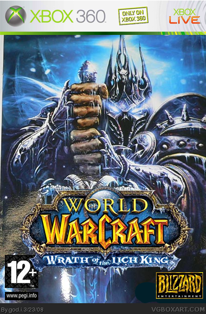
i worked pretey hard on this in and out of making other boxs so can u tell me wat u think
[ Reply ]
prety.....ok but not ur best work
[ Reply ]
i like it, but the logo is placed badly, because it's overlapping the 12+. also the main pic is a lil blurry.
[ Reply ]
I agree whit #3, and only for xbox 360?
sorry, I dont like it...
[ Reply ]
il update that stuff but if it was all changed what would you think
Edited at 1 decade ago
[ Reply ]
what did you update?
[ Reply ]
i moved th logo and shrpened the images also i made the lich king darker and removed only 4 xbox
[ Reply ]
wow that looks great! fave.
[ Reply ]
thanks
[ Reply ]
The Good:
- The picture looka amazing
- PEGI and Blizzard logo are good
- Game logo's well cut
The Bad:
- Because you removed "Only on Xbox 360 there is a big white spot.
- the PEGI logo should be white in this case
Overall, it looks good. 87/100
[ Reply ]
#10 if i updated that stuff what would you give me
[ Reply ]
evklinken what about now
[ Reply ]
and isn't just PAL boxes that uses pegi?
[ Reply ]
Judging from the fact that it's really grainy and there appears to be something cut off in the bottom right, I'd guess that you took the official box and put it on a 360 template.
EDIT: Not the official, but still a phail:
link
Edited at 1 decade ago
[ Reply ]
Too sharp.. no NTSC or Pal logo.. but it still looks pretty good 3.4/5
[ Reply ]