#16 not bad at all .... i think more text and better fonts would do it sum good ... other then that its good ... lov the screens of mario and the backgound picture is nice but bowser is blocked =]
FTW it has no synopsis, but yet i gets mad faves, and the font i bad, FTW!!! the design is nice but im not faving because the back doesnt seem official
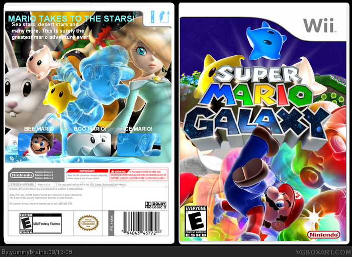
It's not bad, but the whole thing's really crowded. The lumas are covered up by the logo, Rainbow Mario on the front is really big and cut off (why is there a giant Rainbow Mario behind normal Mario anyway?), and Bowser's face is covered up on the back. Also, the back doesn't really tell you alot about the game...
WAYYYY to crowded for my liking. Some characters are covered up, and I'm afraid the back font+text are really bad. I also don\t think ice mario should be on there twice. Sorry, but 3 out of 5
 Super Mario Galaxy Box Cover Comments
Yeah, credit to CM for the temp and PR for the renders. Star89er for the planets and LK for the BG.
Enjoy.
[ Reply ]
i think its awesome it hof approved and it really awesome got to be the offical cover insted of the freaky flying mario!!!!
5/5 + Fav!
[ Reply ]
#2, Wow, thanks!
[ Reply ]
DAMN =D +fav
[ Reply ]
:OMG
[ Reply ]
Thanks guys.
Keep the comments coming.
Edited at 1 decade ago
[ Reply ]
#6, whoop-tee-doo, great!
p.s., yummy.. i'll be posting a donkey konga 2 box soon. i'd appreciate a comment from you :D!
[ Reply ]
Is there something I'm missing here?
[ Reply ]
Whoa, nice. This is very original. 5/5
[ Reply ]
Wow, Nice job!
Edited at 1 decade ago
[ Reply ]
#8, What do you mean?
Thanks guys!
Oh and Ayron. I sure will do.
Edited at 1 decade ago
[ Reply ]
Colourful and nice looking. Keep it up !
[+fav]
[ Reply ]
9 favs, that's awesome!
[ Reply ]
i'd love to see a back for this
[ Reply ]
#14, I'll try man.
[ Reply ]
Updated!
[ Reply ]
#16 not bad at all .... i think more text and better fonts would do it sum good ... other then that its good ... lov the screens of mario and the backgound picture is nice but bowser is blocked =]
i will fav =]
[ Reply ]
FTW it has no synopsis, but yet i gets mad faves, and the font i bad, FTW!!! the design is nice but im not faving because the back doesnt seem official
[ Reply ]
#18, I think this is yummy's first back. Try for more advice then scream.
Edited at 1 decade ago
[ Reply ]
#17, Wow thanks man.
#18, Sorry, i didn't really understand a word of that.
#19, It isn't, but i havn't done many.
[ Reply ]
i thinks this box is pretty awsome +fav nice job
[ Reply ]
Keep the comments coming guys.
Thanks dude.
I hope this gets hof btw...
Edited at 1 decade ago
[ Reply ]
#20, sry yeah, just wanted to put out about the advice thing
[ Reply ]
#23, Ok that's fine.
[ Reply ]
it looks good, but its too crowded.
[ Reply ]
#25, Mehhh, I liked how I made it crowded.
[ Reply ]
#26, gotta agree i think thats what makes the box stand out from the rest ... its a good effect for galaxy
[ Reply ]
#25, idk i kinda like the crowdedness of this box its pretty cool
[ Reply ]
It's not bad, but the whole thing's really crowded. The lumas are covered up by the logo, Rainbow Mario on the front is really big and cut off (why is there a giant Rainbow Mario behind normal Mario anyway?), and Bowser's face is covered up on the back. Also, the back doesn't really tell you alot about the game...
[ Reply ]
My thoughts excactly!
#29, Okay, your choice.
Edited at 1 decade ago
[ Reply ]
the back kinda lost me, use better font
[ Reply ]
WAYYYY to crowded for my liking. Some characters are covered up, and I'm afraid the back font+text are really bad. I also don\t think ice mario should be on there twice. Sorry, but 3 out of 5
[ Reply ]
#8, Let me know if you figure out what it is.
[ Reply ]
This is definitely your best yet. Way to improve and keep it up m8! ;)
[ Reply ]
i like this box but work on the back a little more its coming out nicely
[ Reply ]
Okay, thanks guys. I'm not so good at backs.
[ Reply ]
#36, just keep tryin...no worries you will get better =]
[ Reply ]
#37, I definatly will.
[ Reply ]
Good attempt, even if I don't find the back as good as the front =p
[ Reply ]
#39, Well, yeah, the front is awesome!
:P
Jks
[ Reply ]
WOW! 10/5.Is there rly an Ice Mario?
Edited at 1 decade ago
[ Reply ]
#41, If it's a 10/5 why not fav?
[ Reply ]