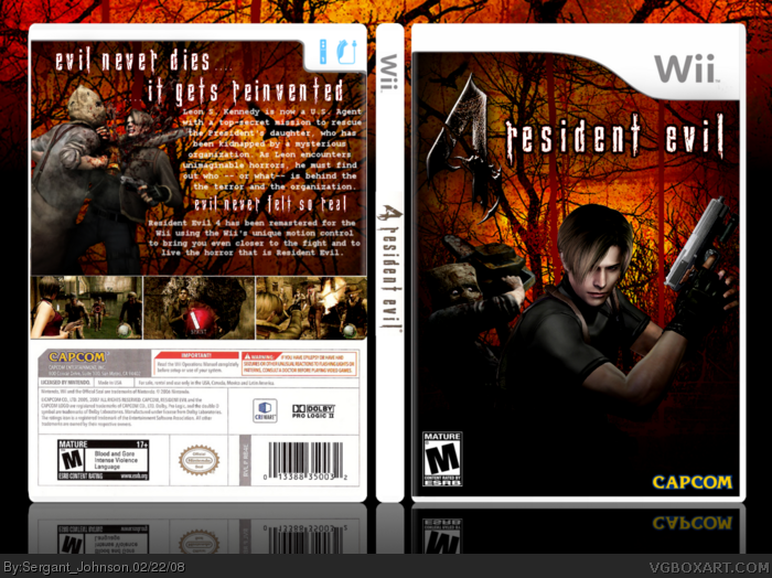
Here is my new box. I wasn't happy with my last RE4 box so I figured I'd rework it and redo it on Wii. This is I came up with. The template on the back is scanned so pardon the minor bluriness I wanted it to be as offcial as possible. Hope you all like it. Its been indesign since my last box. Enjoy, comments and some constructive critism would be cool. Thanks everyone.
#6, You know what E_G i tried that orignally but it seemed really akward because it than blended with the background trees and such so I decided to just leave it with a nice Xach-Effect.
#9, Yup I think for my next box I'm going to post in the forums first so I can get some ideas like that. The only problem is that not alot of people comment on WIP threads usually.
Really nice. The text on the back (courier new I think) is hard to see though (kinda blurry) and I don't like the 2nd tagline (Evil Never Felt so Real).
#11, Hmmm I kinda of liked the second tag line it seemed to fix. Maybe I was wrong I'll ask more people next time before I make a second tagline like that.
 Resident Evil 4 Box Cover Comments
Here is my new box. I wasn't happy with my last RE4 box so I figured I'd rework it and redo it on Wii. This is I came up with. The template on the back is scanned so pardon the minor bluriness I wanted it to be as offcial as possible. Hope you all like it. Its been indesign since my last box. Enjoy, comments and some constructive critism would be cool. Thanks everyone.
-Sergeant Johnson-
[ Reply ]
I like it.
[ Reply ]
love it. because you put the chainsaw guy on :P
[ Reply ]
Nice.
[ Reply ]
#3, LOL yeah i saw that pic and i was like wow Vengeance would be proud.
[ Reply ]
I really like it, the synopsis' text could do with a black outline.
[ Reply ]
#6, You know what E_G i tried that orignally but it seemed really akward because it than blended with the background trees and such so I decided to just leave it with a nice Xach-Effect.
[ Reply ]
very impressive
[ Reply ]
#7, I think it would make the text stand out better but fair point.
[ Reply ]
#9, Yup I think for my next box I'm going to post in the forums first so I can get some ideas like that. The only problem is that not alot of people comment on WIP threads usually.
[ Reply ]
Really nice. The text on the back (courier new I think) is hard to see though (kinda blurry) and I don't like the 2nd tagline (Evil Never Felt so Real).
Otherwise really good
[ Reply ]
#11, Hmmm I kinda of liked the second tag line it seemed to fix. Maybe I was wrong I'll ask more people next time before I make a second tagline like that.
[ Reply ]
that's really rad.
[ Reply ]
#13, haha thanks lets just hope other people think so that way it doesn't get forgotten like my last couple of boxes.
Edited at 1 decade ago
[ Reply ]
Muhuh, I love it when the protagonist of a game gets decapitated by a chainsaw.
Great box BTW, faved.
Edited at 1 decade ago
[ Reply ]
12, if you like it best, your not wrong.
[ Reply ]
#15, Everytime I hear a chainsaw now I think of RE4.
[ Reply ]
Idk whats with people making spines so thin but its really weird looking.
Other than that i really like the box. Great job.
[ Reply ]
#18, I don't know that's just how the template is so I just kept it like that.
[ Reply ]
OMG! I cant believe I missed this box. Awesome job!
[ Reply ]
sweet work, love your take on it =D
[ Reply ]
#21, Thanks. i'm surprised no one has used the Orange and reconcept before me.It really fits.
[ Reply ]
wow i missed this. 5/5 +fav
[ Reply ]
Kickass box, man. +fav from me! =D
[ Reply ]