the front is great, the back isn't as much but it's still good. oh, and I think you put the gradient on the wrong way on the layer mask for the reflection, it fades in rather than fade out.
oh, i get it now... took me a while to decode that load of nonsense... stop it with that, i know this isn't the actual colour scheme to a normal MP3C box but I still like it. Yours was too green for my liking.
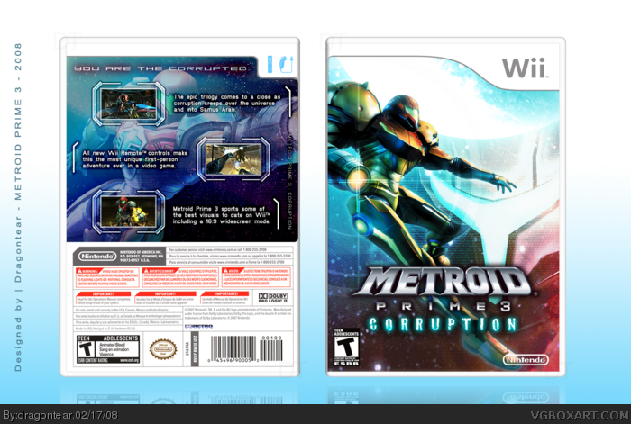
 Metroid Prime 3: Corruption Box Cover Comments
Wasn't going to post this until I changed my mind recently. Enjoy! ;]
[ Reply ]
Sexy, it's pretty bright but I guess that's part of the style.
[ Reply ]
Very nice.
[ Reply ]
Yes, that's the way to do it! Keep 'em coming!!
[ Reply ]
5/5
[ Reply ]
damn, that's beautiful =D
[ Reply ]
the front is great, the back isn't as much but it's still good. oh, and I think you put the gradient on the wrong way on the layer mask for the reflection, it fades in rather than fade out.
[ Reply ]
beutiful
[ Reply ]
This is why you're on my favorite authors list.
[ Reply ]
Look! link (check the middle box)
Edited at 1 decade ago
[ Reply ]
You were my inspiration when I first started, and this is why you still are now.
[ Reply ]
#5, but zoomg it aeend da rite kuhl0r skeem
[ Reply ]
#12, .....huh??
[ Reply ]
#13, But zomg, it ain't the right color scheme
[ Reply ]
oh, i get it now... took me a while to decode that load of nonsense... stop it with that, i know this isn't the actual colour scheme to a normal MP3C box but I still like it. Yours was too green for my liking.
[ Reply ]
:P
[ Reply ]
stunning.
[ Reply ]
We're waiting... ;)
[ Reply ]
#18, No kidding. Make a new box!
[ Reply ]