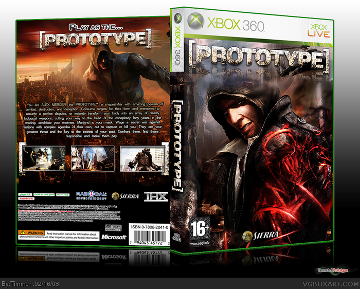
Darn.. another Prototype box when I'm working on one! LOL ---- AND a good one at that! Love the front... apart from the way the logo doesn't blend with the image. Why is the main image background blurred a little while the background of the logo so sharp?
Back is great... borders are a little simple... but okay. I don't like the white stroke on the spec boxes however... better if you made the text in white or lighter colour. Also, you haven't added the PEGI 16+/Violence etc. icons.. above barcode... unless they are black! LOL ---- 9/10
Thanks for the comments and favs. I didn't add the PEGI stuff because I forgot about them since I finished this box after waking up and I felt a bit dazzed xD. Anyways I think this box is going to be nothing when you put your Prototype box out.
 Prototype Box Cover Comments
This took me a while to make but I was pleased with the outcome, hope you guys like it :D
[ Reply ]
I like this! Very clean, great style! +fav
[ Reply ]
holy shit dude, that rules.
[ Reply ]
Front is simply amazing +fav
[ Reply ]
Front feels a little to busy and clear in my point of view.
[ Reply ]
great job
[ Reply ]
beutiful other then the logo reflection
[ Reply ]
Darn.. another Prototype box when I'm working on one! LOL ---- AND a good one at that! Love the front... apart from the way the logo doesn't blend with the image. Why is the main image background blurred a little while the background of the logo so sharp?
Back is great... borders are a little simple... but okay. I don't like the white stroke on the spec boxes however... better if you made the text in white or lighter colour. Also, you haven't added the PEGI 16+/Violence etc. icons.. above barcode... unless they are black! LOL ---- 9/10
Edited at 1 decade ago
[ Reply ]
Thanks for the comments and favs. I didn't add the PEGI stuff because I forgot about them since I finished this box after waking up and I felt a bit dazzed xD. Anyways I think this box is going to be nothing when you put your Prototype box out.
[ Reply ]
*jawdrop*
[ Reply ]
Another brilliant and unfortunately overlooked box by Timmeh. Clearly deserves more favs.
[ Reply ]
#11, Agreed.
[ Reply ]
I love the front cover, nice one 5/5 fav+.
[ Reply ]
Apparently Timmeh is to E_G as Mad Spike is to Reed...
[ Reply ]
11, I don't think that is necessary true I think he is just stating that some of my boxes just go unnoticed.
Thanks for the comments and favs
[ Reply ]
am i the only one who thinks this game is going to really suck?
[ Reply ]
Nice work.
Has this really cool feel to it =D
[ Reply ]
#16, no.
[ Reply ]
YES! Congrats!
[ Reply ]
Probably one of the best Prototype boxes on the site.
[ Reply ]
#16, Do you like ANY games? Like, at all?
[ Reply ]
Yay HoF, just noticed it :D. Thanks for the comments and favs.
[ Reply ]
Great man, do you have the printable version?
[ Reply ]
the discharge?
[ Reply ]
and Printable?
[ Reply ]