Okay I did not copy ClonedX's idea as i have been working on this box for several days, since I finished my AC box!
The logo was created by me! This took me ages!! I think this is one of my best boxes so far and i'm sure you can all tell im getting much better at box making =]
Credit to GuitarMan for telling me link to the background! I added the planet myself =D
I really like it! But, its missing the extra "BAM" for me to fave it. It just seems like theres something missing to me. But great job, you're really improving! 5/5
wow cerium you have impressed me....again, even though this wont really make a difference in wether it will be going into the HoF because of my rank, +fav
#20 To be honest even if your fav wont help my box get into the HoF, It still means alot to me and it makes me happy that people are liking my box, regardless of rank =]
#30 Exactly!
Im actually quite offended that im being accused of lying about making the logo!
What type of person would actually lie about making something, use it and then claim its theirs?
#33 I use Gimp!
And what is wrong with my box? You might not like it but several other people do! Are you implying i put a good logo on a bad box and that is why you dont believe this logo is mine?
#35 Your right!
I dont mean to fight, I just dont like what he is saying very much! He thinks because the Logo is so much better quality than the actual box itself, I couldn't possible of made it because i'm not good enough!
Its not nice when you spend ages making something and is really proud of it then you get people who think you didn't even make it yourself =[
I'm lovin' the box art in general [as well as the nifty logo], but I'm not feeling Sonic from his front cover pose. I think it should more dynamic [like Mario's pose on the SMG box art, to bring up the obvious game comparison] and more action-focused [like Sonic]?
No disrespect, but this is surreal. It probably relates to when it was uploaded, but compared to today's standards, this box belongs nowhere in the 40-50 fav range. I have no idea what makes this box so amazing. Given, it isn't horrible, nor is it breathtaking. It looks a bit lower than mediocre and I find it odd that it has these many favs. I don't like the box, but hey, you got 47 people behind you so, what do I know?
#51 I agree this box doesn't seem that great compared to my other boxes (especially that back) but bear in mind when I uploaded this box, the whole concept of "Super Sonic Galaxy" was still unique and original. And I'm still quite proud of that logo considering I was still a noob when I made it lol.
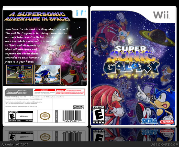
 Super Sonic Galaxy Box Cover Comments
Okay I did not copy ClonedX's idea as i have been working on this box for several days, since I finished my AC box!
The logo was created by me! This took me ages!! I think this is one of my best boxes so far and i'm sure you can all tell im getting much better at box making =]
Credit to GuitarMan for telling me link to the background! I added the planet myself =D
Edited at 1 decade ago
[ Reply ]
That's a NICE logo!
[ Reply ]
Nice logo! Great Box.
P.S. So that's what you needed the background for.
Can you PM me the logo.
[ Reply ]
i agree with the both of you thats a good logo and its way better that that other guys super sonic galaxy
[ Reply ]
It's great! +FAV
[ Reply ]
Great job! Your best so far! +Fav
[ Reply ]
it's an awsome box. i'd love to try and make this one to. you don't need to PM me the logo. i'll get it from G-man later on. XD
[ Reply ]
I really like it! But, its missing the extra "BAM" for me to fave it. It just seems like theres something missing to me. But great job, you're really improving! 5/5
[ Reply ]
great box/great idea
+fav
[ Reply ]
#8 Do you have any idea what that missing "BAM" could be?
Maybe a bit of green? I noticed this box doesn't have any green on it! Hmmmm
[ Reply ]
I agree with #8.
I think "something" is missing, something in the background.
I don't know... but I like it! great job!
[ Reply ]
#11 Any suggestions to what i could add to the background?
[ Reply ]
#1, your logo is amazing. the sparkles added to the effect very nicely. you could make a career out of this.
[ Reply ]
this box pwns mine...
[ Reply ]
#13 Lol I wish but thanks! I dont think im good enough to have a career in box making =D
[ Reply ]
#12 what about a super sonic image?
[ Reply ]
do you know...i like this. hmm..yes. +fav
[ Reply ]
ew... you used the Sonic X artwork. That's a sin.
[ Reply ]
#16 You rarely find Super Sonic on the front of any box art for some reason, I guess Sega like to keep it secretive lol
#17 Thanks =]
#18 In all fairness, Sonic X is a better cartoon than Sonic Underground.
[ Reply ]
wow cerium you have impressed me....again, even though this wont really make a difference in wether it will be going into the HoF because of my rank, +fav
[ Reply ]
#20 To be honest even if your fav wont help my box get into the HoF, It still means alot to me and it makes me happy that people are liking my box, regardless of rank =]
[ Reply ]
i love the background +fav
[ Reply ]
i can see this becomin a HoF!
[ Reply ]
#23 Thanks man! I really hope so! It would be nice to have a first unofficial HoF box =]
[ Reply ]
I don't like it. Even though I hate that logo, I don't believe you actually made it. But that's just what I think, so don't flame me.
[ Reply ]
#25, I agree, and the placement of the back looks the same as all of your others, and that's a bad thing. :|
[ Reply ]
#25 Yes i did make the logo! Why dont you believe i did?
#26 Which other boxes look the same as this?
Edited at 1 decade ago
[ Reply ]
#27, my bad, I'm probably thinking of something else. I still don't like the back.
[ Reply ]
#28 Lol thats okay! Everyone has their opinion =]
I still dont understand why Iron Man thinks i lied about making the logo.
[ Reply ]
If people can make their own logos that are better than this one, why can't you beleive that Cerium made this one?
[ Reply ]
#30 Exactly!
Im actually quite offended that im being accused of lying about making the logo!
What type of person would actually lie about making something, use it and then claim its theirs?
[ Reply ]
#31, I really don't know. But anyways, i hope this makes it to the HoF!
P.S: Check your PM's please.
[ Reply ]
#31, I'm not accusing you of lying. What I don't beleive is that you made a good logo and then put it on this box. You don't even have Photoshop.
P.S. What program DO you use?
[ Reply ]
#33 I use Gimp!
And what is wrong with my box? You might not like it but several other people do! Are you implying i put a good logo on a bad box and that is why you dont believe this logo is mine?
[ Reply ]
Guys! #33 if you could be more clear in a nicer way then i think it will solve more than fighting.
[ Reply ]
#35 Your right!
I dont mean to fight, I just dont like what he is saying very much! He thinks because the Logo is so much better quality than the actual box itself, I couldn't possible of made it because i'm not good enough!
Its not nice when you spend ages making something and is really proud of it then you get people who think you didn't even make it yourself =[
[ Reply ]
Guys Simmer Simmer! XD you all need to stop fighting. Iron Man he made the logo, so shut the duck up. now we can all be friends again! :)
[ Reply ]
#37 Thank you! Lets all be friends yes =]
[ Reply ]
I have to admit that this box is better than mine. The only thing i dont like is that you used the sames picture of Shadow twice...
5/5
[ Reply ]
#39 You'd you be suprised how many official box arts use the same image twice =P
[ Reply ]
#39, #40 does have a point. XD
[ Reply ]
#41 Thanks =]
[ Reply ]
Sweet man, this box rocks.
5/5
[ Reply ]
#43 This is an old box but thanks alot :)
[ Reply ]
why tails is not on it
[ Reply ]
sorry!.
[ Reply ]
GREAT! 4/5 +fav
[ Reply ]
Great! 5/5
[ Reply ]
I'm lovin' the box art in general [as well as the nifty logo], but I'm not feeling Sonic from his front cover pose. I think it should more dynamic [like Mario's pose on the SMG box art, to bring up the obvious game comparison] and more action-focused [like Sonic]?
Nevertheless, this is a rad 4/5 for me. ^-^
[ Reply ]
Faved because your Cerium and all bow before you.
[ Reply ]
No disrespect, but this is surreal. It probably relates to when it was uploaded, but compared to today's standards, this box belongs nowhere in the 40-50 fav range. I have no idea what makes this box so amazing. Given, it isn't horrible, nor is it breathtaking. It looks a bit lower than mediocre and I find it odd that it has these many favs. I don't like the box, but hey, you got 47 people behind you so, what do I know?
[ Reply ]
Please PM me the logo, I want to make this box!
[ Reply ]
#52, Please don't make the freaking box. SMG spin offs suck.
[ Reply ]
#51 I agree this box doesn't seem that great compared to my other boxes (especially that back) but bear in mind when I uploaded this box, the whole concept of "Super Sonic Galaxy" was still unique and original. And I'm still quite proud of that logo considering I was still a noob when I made it lol.
[ Reply ]
#54, I see.
[ Reply ]
i don't like it. The front renders should be 3d like the screenshots on the back.
[ Reply ]