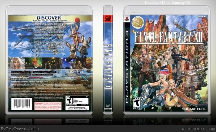
One of my favorite boxes I've made. I thought i would go with a new style with the nice clean background. I might update my other boxes to this style background, should i? Well i love the way it turned out =]
its nice, but perhaps fill up the empty side on the back beside the text. it's not balanced as you have those 3 on one side and nothing on the other. perhaps add a little glow around the chars on the front so they stand out more against the background cause of its variety of colours. (something i would try)
all in all i think this is a great box, but i agree with #7
on the front the characters don't stick out as well so i would suggest raising the contrast on the characters to make them more colorful and fit in with teh other images, but also fade/lighten/blur or anything else like that that would make the background weaker against the characters to help them stick out.
 Final Fantasy XII Box Cover Comments
One of my favorite boxes I've made. I thought i would go with a new style with the nice clean background. I might update my other boxes to this style background, should i? Well i love the way it turned out =]
Thanks guys
Edited at 1 decade ago
[ Reply ]
omhwtfbbq so nice.
[ Reply ]
You're just the man.
[ Reply ]
It's beautiful, but the two people sitting in front aren't really sitting on anything.
Edited at 1 decade ago
[ Reply ]
Thanks guys, so you think i should update my boxes to this kind of background?
Edited at 1 decade ago
[ Reply ]
#5, why not?
[ Reply ]
its nice, but perhaps fill up the empty side on the back beside the text. it's not balanced as you have those 3 on one side and nothing on the other. perhaps add a little glow around the chars on the front so they stand out more against the background cause of its variety of colours. (something i would try)
still and excellent box overall.
[ Reply ]
all in all i think this is a great box, but i agree with #7
on the front the characters don't stick out as well so i would suggest raising the contrast on the characters to make them more colorful and fit in with teh other images, but also fade/lighten/blur or anything else like that that would make the background weaker against the characters to help them stick out.
[ Reply ]
lovin' the new style. iz nice!
[ Reply ]
#7, I did try it and i sent the work in progress to Ross and a copy other people and they agreed no glow on the front. It looks cleaner we thought.
[ Reply ]
It's a good layout and design but the character kinda look stuck on.
[ Reply ]
can you say "Hall Of Fame!?"
[ Reply ]
Well there wasn't much i could have done to make them not look so stuck on #11 but thanks for the comment and everyone else that commented.
[ Reply ]
I can't believe I never noticed this!
[ Reply ]