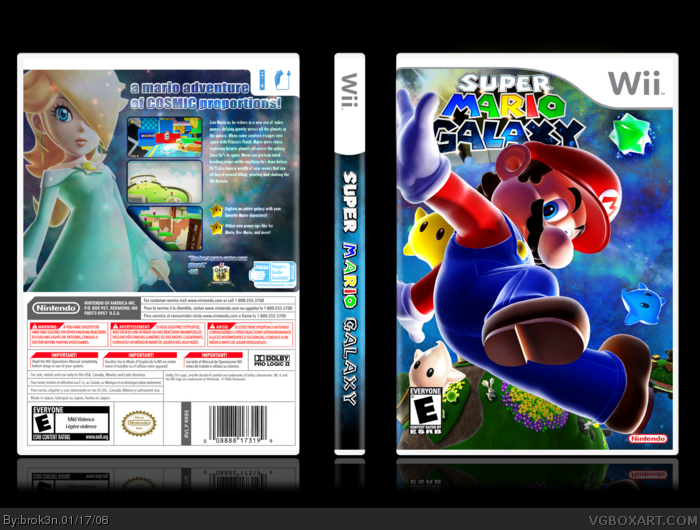
2 things: Back could be a bit more interesting, right now it looks a tad bit dull, spice things up with slightly bigger text, better fonts, Mario renders placed on the back and stuff. Mario is too huge on the front...
those dev and esrb logos are annoying me sooooo much.... it's be pretty good if that's not all I saw in it :P the nintendo needs to be a bit bigger, and the esrb needs to be down. down boy! down!
Mario is wayy to large, he's covering up the logo which is randomly placed in the corner. why don't you use a different image of Mario because this one takes up too much space and it looks lame anyway.
Prollems: The logo can't get any bigger without looking super blurry.
It didn't look right with Mario smaller because there would have been too much empty space. And if I put the logo on top of Mario, it would have covered him up.
I also can't update this, for obvious reasons. >.>
Now this is just frustrating. I'm sorry, but it is. I made nigh everything on this box myself, spend several days working at it until I get everything right, and I get six comments? Go ahead, flame me. But I'm really not happy.
 Super Mario Galaxy Box Cover Comments
Yahoo.
Ross's temp.
[ Reply ]
Yooha! I like it!
[ Reply ]
Yay!
[ Reply ]
2 things: Back could be a bit more interesting, right now it looks a tad bit dull, spice things up with slightly bigger text, better fonts, Mario renders placed on the back and stuff. Mario is too huge on the front...
But still its a great box!
[ Reply ]
those dev and esrb logos are annoying me sooooo much.... it's be pretty good if that's not all I saw in it :P the nintendo needs to be a bit bigger, and the esrb needs to be down. down boy! down!
[ Reply ]
Mario is wayy to large, he's covering up the logo which is randomly placed in the corner. why don't you use a different image of Mario because this one takes up too much space and it looks lame anyway.
[ Reply ]
Pretty sick, but Mario is too big, and the logo is too small. Fix it and you'll get a fav from me.
[ Reply ]
I like it ! Just add another bullet (luma).
[ Reply ]
Prollems: The logo can't get any bigger without looking super blurry.
It didn't look right with Mario smaller because there would have been too much empty space. And if I put the logo on top of Mario, it would have covered him up.
I also can't update this, for obvious reasons. >.>
[ Reply ]
The spine looks cool but the official spines are all white. I like it.
[ Reply ]
Yeah, I know. I just HATEHATEHATTEEEE any part of a box looking plain. >__>
[ Reply ]
Now this is just frustrating. I'm sorry, but it is. I made nigh everything on this box myself, spend several days working at it until I get everything right, and I get six comments? Go ahead, flame me. But I'm really not happy.
[ Reply ]
i RePeAT...
[ Reply ]
this is good
[ Reply ]
#14, that...
is what I said. :)
[ Reply ]
XD Thanks for the fave, bruh.
EDIT: You too, Nick. *tips hat*
Edited at 1 decade ago
[ Reply ]
well umm i never commented on this so here it is:
comment
now i like this box and i think you should too :P
[ Reply ]
#17, XD
[ Reply ]