Credit goes to TwilightMystics for the amazing PS3 template. A huge thanks goes to Ladykiller for the logo and placement of it. Thanks bro. I appreciate it. Anyway, tell me what you think! If you add this box to your favorites list, please comment as well.
#6, which reminds me! Credit to hide07 from deviantART for the art. I keep forgetting to give credit when its due. Thanks for being honest though. What makes the back cluttered anyway?
some angry people here. i love this box. the text, though a little hard to read here, would be legible as is if this were a physical box i were holding it. it looks very professional. 5/5 +fav
 Final Fantasy VII Box Cover Comments
ummm
[ Reply ]
Ever heard of a drop shadow I mean you can barley read the words on the back man but nice box
[ Reply ]
...wow.
[ Reply ]
Credit goes to TwilightMystics for the amazing PS3 template. A huge thanks goes to Ladykiller for the logo and placement of it. Thanks bro. I appreciate it. Anyway, tell me what you think! If you add this box to your favorites list, please comment as well.
[ Reply ]
#2, I have. I wasn't born yesterday. Thanks for the compliment. If you want to read the text, check out this link
Edited at 1 decade ago
[ Reply ]
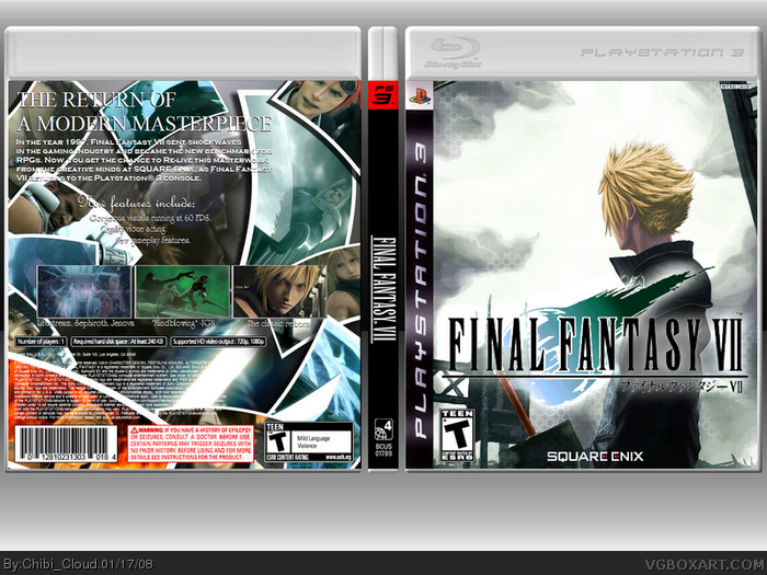
Is the front fanart? Its an ok box, but the back seems really cluttered. 3/5
[ Reply ]
#5, Duhh I was being Sarcastic ever heard of that
[ Reply ]
#6, which reminds me! Credit to hide07 from deviantART for the art. I keep forgetting to give credit when its due. Thanks for being honest though. What makes the back cluttered anyway?
[ Reply ]
#7, sarcasm is hard to tell through online, remember? No need to act all tough on me, and wheres your punctuation?
Edited at 1 decade ago
[ Reply ]
#8, The pictures of all the characters on the back. I mean it looks cool, but the text on top of it + more screens makes it a bit messy looking to me.
[ Reply ]
#10, what if I took away the extra screens? The one containing descriptions.
Edited at 1 decade ago
[ Reply ]
#11, I think itd look better ^^
[ Reply ]
some angry people here. i love this box. the text, though a little hard to read here, would be legible as is if this were a physical box i were holding it. it looks very professional. 5/5 +fav
Edited at 1 decade ago
[ Reply ]
Thank you numerobetically!
[ Reply ]
it's not bad.
[ Reply ]
Wow! 5 favorites already? #15, thank you, and neither is your mom. You do know I'm just kidding, right? Lol
[ Reply ]
I like it but I hate the back temp info. Looks squished.
[ Reply ]
holy crab chibi.
as much as you like some of mine, i like some of your boxes.
Which, in lame men's term, means +Fav and 5/5.
[ Reply ]
#18, lol thanks Ayron. I appreciate the favorite and the high score.
[ Reply ]
The back looks like it took a while lol.
[ Reply ]
#20, it did. Lol. Thanks for the favorite, TrevOwnz.
[ Reply ]
hmmm, the front seems like: ehh... and the back seems like: WOW lol
pretty good though..
[ Reply ]
This looks amazing! please tell me you didn't make this on paint, too. T.T
+fav
[ Reply ]
#23, haha.^^ You feel sorry for me...?
[ Reply ]
sweet, i love the back +fav
[ Reply ]
the back is awesome
[ Reply ]