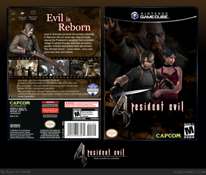
Finally, something worthwile posted by me.
I know i kinda promised i wouldn't make a bad box. but promises are to be broken.
With that said, here's my Re4 box [ yes, i hopped on the ride of equality and boringdom].
Credit to LK for:
- template
- grunge background
- RE4 logo
- Filmstrip
Also, major credit to the people who helped me throughout the process of making this.[ you know who you are ]
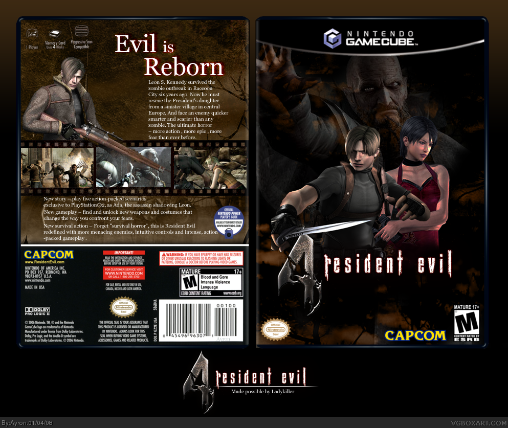
What is up with all the re boxes all of a sudden from everyone. Well this is pretty kewl. But the front looks weird. Cause leon and ada's skin looks messed up
I don't like how you arranged the text, stretch it out a little so it takes up more space and it's longer horizontally, because here it's just squashed in a small pile and looks kinda lame.
It's great. I like it, but there's a few flaws. A part of Leon's fist is cut off on the front of the box. It looks like there's two Adas because Ada's arm looks strange. I like the blending thats going on. I added this box to my favorites because I know effort was put into this. Nice job.
 Resident Evil 4 Box Cover Comments
Finally, something worthwile posted by me.
I know i kinda promised i wouldn't make a bad box. but promises are to be broken.
With that said, here's my Re4 box [ yes, i hopped on the ride of equality and boringdom].
Credit to LK for:
- template
- grunge background
- RE4 logo
- Filmstrip
Also, major credit to the people who helped me throughout the process of making this.[ you know who you are ]
Greetz,
-Ayron
[ Reply ]
What is up with all the re boxes all of a sudden from everyone. Well this is pretty kewl. But the front looks weird. Cause leon and ada's skin looks messed up
[ Reply ]
#2, their...skin?
whatever,thanks. :P
[ Reply ]
holy shiiit. thats kool.
i wish i could make something like that.
oh and wtf is that weird light thing on your front. xD
[ Reply ]
#4, which weird light thing?
[ Reply ]
the one pretty much in the middle bottom (front) the line light thingy lol cant explain xD
Edited at 1 decade ago
[ Reply ]
#3, Yea their skin its like reddish and pinkish color
[ Reply ]
#6, the change of light?
that's because of the mixed wallpapers.. i couldn't avoid that.
#7, i can't help that. they were like tht >.<
[ Reply ]
Pretty good, there's something I don't like though. I think it's the font choice. I feel that's a wrong font to use, unless if its Caps Lock.
[ Reply ]
#9, i actually pretty much liked the font. :P.
thanks though.
[ Reply ]
I don't like how you arranged the text, stretch it out a little so it takes up more space and it's longer horizontally, because here it's just squashed in a small pile and looks kinda lame.
[ Reply ]
UPDATE, thanks for criticism.
[ Reply ]
It looks really nice. But there are two things I don't like : Leon on the front, he looks crushed and the bottom text placement.
Nice job, really nice job :D
[ Reply ]
#13, thank you ;)
[ Reply ]
Love it.
[ Reply ]
#15, thank you ;)
[ Reply ]
It's great. I like it, but there's a few flaws. A part of Leon's fist is cut off on the front of the box. It looks like there's two Adas because Ada's arm looks strange. I like the blending thats going on. I added this box to my favorites because I know effort was put into this. Nice job.
[ Reply ]
#17, i can't help leon's fist, nor Ada's arm, since they were in the picture this way.
sorry.
[ Reply ]
once again, well done man. great job utilizing teh materials :)
[ Reply ]
#19, Thanks LK ;)
[ Reply ]
I really like the way it turned out.
[ Reply ]
Thanks E_G.
it's almost off of the front-page already? O.O
[ Reply ]