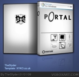
First official box design. I purposely discluded any logos, specs, etc. because I didn't want it to have a commercial feel. I wanted it to look like something I'd use as a nice cover for a game, rather than a commercially useable one.
Are you planning on finishing the back, or are you just gonna leave it like that? Sorry man, I'm gonna have to give it a 2.5. I agree with #2, it looks a bit unfinished, but it will be awesome if you do the back.
#2, in addition to my comment, I'd like to also say that this tells us nothing about the game. If I saw this in a store and didn't know what Portal was, this really wouldn't help at all.
#5, well, to tell you the truth, I don't see much effort in this. He barely did anything. He didn't even put legal info, screenshots, a description, or anything for that matter.
To be honest, I don't understand what isn't finished about the back. As stated, I didn't design it to look like a commercial box. Thus no screenshots, no logos, no information. It was made to be a nice looking cover for a game to go on a shelf. I believe you guys are rating it as something it isn't intended to be.
Also, #6, you'll notice that every icon on the cover, except the cake, is made by myself. It took plenty of time and effort. And since you didn't see it the first time I said it, I'll assume you're not going to read it the second time, and I'll say it once more, just for you:
It's not meant to be commercial. That means I didn't design it to help sell the game. It isn't meant to be sold at all, so logos, ESRB rating, information for the game, screenshots, etc. are completely unnecessary, and degrade the quality of the cover.
Thanks for the attention though. I'd rather have negative comments on my work than no comments at all.
#8, I actually considered "Delicious and Moist Edition" for either the back or the front like you suggested. I also considered a GLADoS quote, but decided against it (I'm a huge sucker for minimalism)
Also, I'm not sure what you're referring to when you mention setting the opacity to 50%.
#10, Yes. CS2. I mean, I understand what opacity is, and how to set it to 50%, I just don't understand what you're talking about when you say "to fit."
Hey, I think this is really good. I really like the design of the front, and those who are moaning about not enough stuff then maybe should read the description.
Also, I was wondering if I could have the template for this? PM me, PLEASE.
Yeah. Everybody knows that bumping old boxes causes..um..it.
...uh..
I'm sure there's a reason for not bumping old boxes. I mean, they're OLD. Why would someone have an opinion on them, right? And more so, even if they DID have an opinion on the box, it's an OLD box, so it doesn't deserve to have that opinion be voiced.
Fuck this. I'm going to bump a shitload of old boxes.
 Portal Box Cover Comments
First official box design. I purposely discluded any logos, specs, etc. because I didn't want it to have a commercial feel. I wanted it to look like something I'd use as a nice cover for a game, rather than a commercially useable one.
That said: Have at me.
[ Reply ]
It looks unfinished. 2/5
Edited at 1 decade ago
[ Reply ]
Are you planning on finishing the back, or are you just gonna leave it like that? Sorry man, I'm gonna have to give it a 2.5. I agree with #2, it looks a bit unfinished, but it will be awesome if you do the back.
Edited at 1 decade ago
[ Reply ]
#2, in addition to my comment, I'd like to also say that this tells us nothing about the game. If I saw this in a store and didn't know what Portal was, this really wouldn't help at all.
[ Reply ]
i know its plain but i really like it just the companion cube on the back its nice 4/5
[ Reply ]
#5, well, to tell you the truth, I don't see much effort in this. He barely did anything. He didn't even put legal info, screenshots, a description, or anything for that matter.
[ Reply ]
To be honest, I don't understand what isn't finished about the back. As stated, I didn't design it to look like a commercial box. Thus no screenshots, no logos, no information. It was made to be a nice looking cover for a game to go on a shelf. I believe you guys are rating it as something it isn't intended to be.
Also, #6, you'll notice that every icon on the cover, except the cake, is made by myself. It took plenty of time and effort. And since you didn't see it the first time I said it, I'll assume you're not going to read it the second time, and I'll say it once more, just for you:
It's not meant to be commercial. That means I didn't design it to help sell the game. It isn't meant to be sold at all, so logos, ESRB rating, information for the game, screenshots, etc. are completely unnecessary, and degrade the quality of the cover.
Thanks for the attention though. I'd rather have negative comments on my work than no comments at all.
[ Reply ]
I know what you were trying to do, and it looks really good, but I think you should've put like a phrase from the game below the Companion Cube.
And you can set the opacity to 50% to fit.
[ Reply ]
#8, I actually considered "Delicious and Moist Edition" for either the back or the front like you suggested. I also considered a GLADoS quote, but decided against it (I'm a huge sucker for minimalism)
Also, I'm not sure what you're referring to when you mention setting the opacity to 50%.
[ Reply ]
#9, Do you use Photoshop?
[ Reply ]
#10, Yes. CS2. I mean, I understand what opacity is, and how to set it to 50%, I just don't understand what you're talking about when you say "to fit."
[ Reply ]
Hey, I think this is really good. I really like the design of the front, and those who are moaning about not enough stuff then maybe should read the description.
Also, I was wondering if I could have the template for this? PM me, PLEASE.
[ Reply ]
I really like what you've done so far but still, it really looks unfinished. You get my fav because the front looks nice.
[ Reply ]
low res...
really low res
[ Reply ]
suits the game. very nice
[ Reply ]
Incredibly over-looked and underrated. Gets a fav from me.
[ Reply ]
Don't bump old boxes.
[ Reply ]
Yeah. Everybody knows that bumping old boxes causes..um..it.
...uh..
I'm sure there's a reason for not bumping old boxes. I mean, they're OLD. Why would someone have an opinion on them, right? And more so, even if they DID have an opinion on the box, it's an OLD box, so it doesn't deserve to have that opinion be voiced.
Fuck this. I'm going to bump a shitload of old boxes.
[ Reply ]