its an okay box. orange text to the back looks somewhat sucky and the front is too dark for me. 3.5/5 also, the wii remote symbol at the top of the back doesnt say how many players the game is.
ohh, nice, maybe you should add a little something to the title, because it kinda doesn't fit :\ and the text on the back needs a small solid outline and a little darker color. Also with the back, maybe make the whole side darker, it's a little bright. but it's good :)
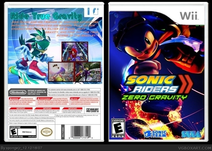
 Sonic Riders Zero Gravity Box Cover Comments
1st post
its an okay box. orange text to the back looks somewhat sucky and the front is too dark for me. 3.5/5 also, the wii remote symbol at the top of the back doesnt say how many players the game is.
Edited at 1 decade ago
[ Reply ]
Hey everyone! Ive been gone for a while but I'm back! I also think this is the best box I ever made. I wont be submitting boxes often so enjoy!
[ Reply ]
ohh, nice, maybe you should add a little something to the title, because it kinda doesn't fit :\ and the text on the back needs a small solid outline and a little darker color. Also with the back, maybe make the whole side darker, it's a little bright. but it's good :)
[ Reply ]
Why does everyone cut the black around the logo. Its suppoe to be there
[ Reply ]
i like this. but like kirbylore said the back is too light and then we've got a really dark front. but this is your best box. 4/5
[ Reply ]
love the box art. very original
[ Reply ]
i like it 4/5
[ Reply ]
me likey, fave and author fave.
Edited at 1 decade ago
[ Reply ]