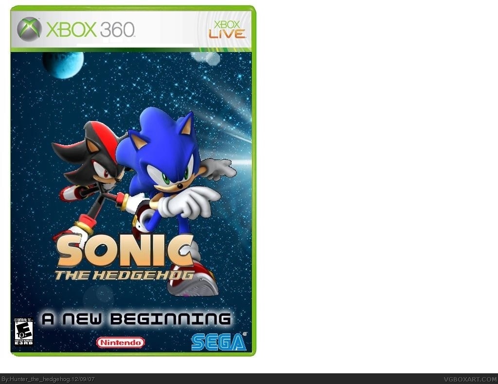
pros:
-good bg
-good title
-cool "A new Beginning" Logo
-great idea
cons:
-the fact of just pasting sonic and shadow where they are "running"
-the nntendo and Sega logos are a bit choppy
-There's a big gap between "A New Beginning" and "Sonic The Hedgehog"
E10+ logo is too small, nintendo logo on 360? (I once did that too)
SEGA and Nintendo logo badly cut, too much of a gap between a new beginning and sonic the hedgehog (as guitarman said)
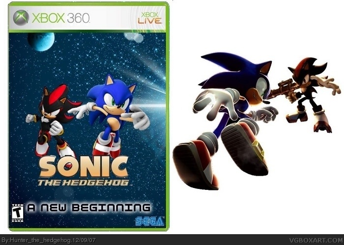
i've updated it, i actually kinda like the sonic jumping towards shadow, theyre both shadow so it looks like the sun is facing them, i just realised, the ring on sonics finger (beside box) looks like its actually emiting light from the background of the box, is angled just right
#8 How about you try and don't add things that don't make sense. Why do you have a big white background. Give it a image not white and plainness. Don't have such a wide background also.
Hunter, are you Oxol by any chance? You both have the same avatars... not a good box.
Bad title.
Bad logo.
Bad cutting.
Bad ESRB.
Bad Sega logo.
Too much stupid white background. 1.5/5
 Sonic the Hedgehog Box Cover Comments
a legendary edition of "Sonic the Hedgehog"
[ Reply ]
pros:
-good bg
-good title
-cool "A new Beginning" Logo
-great idea
cons:
-the fact of just pasting sonic and shadow where they are "running"
-the nntendo and Sega logos are a bit choppy
-There's a big gap between "A New Beginning" and "Sonic The Hedgehog"
Overall 4.2/10
Edited at 1 decade ago
[ Reply ]
#2, you can't count off for no back! That's unfair.
[ Reply ]
#3, ok that parts gone sorry Hunter the Hedgehog
[ Reply ]
E10+ logo is too small, nintendo logo on 360? (I once did that too)
SEGA and Nintendo logo badly cut, too much of a gap between a new beginning and sonic the hedgehog (as guitarman said)
[ Reply ]
#5, oooooooooohhhhhhhhh crap, your right, nintendo logo, im probably gonna spend hours fixing that...
[ Reply ]
Can you get rid of that big white background?
[ Reply ]
im gonna add a update soon, instead of a white background, its gonna be, something totaly out of place, such as mario and luigi butt racing
[ Reply ]
i've updated it, i actually kinda like the sonic jumping towards shadow, theyre both shadow so it looks like the sun is facing them, i just realised, the ring on sonics finger (beside box) looks like its actually emiting light from the background of the box, is angled just right
Edited at 1 decade ago
[ Reply ]
that looks better but put A New Beginning almost directly under sonic the hedgehog. also i like it better because their not running.
[ Reply ]
#8 How about you try and don't add things that don't make sense. Why do you have a big white background. Give it a image not white and plainness. Don't have such a wide background also.
[ Reply ]
or just get rid of the side pic and center the box itself that way there's no big gap. or get a back for it.
[ Reply ]
(double post) deleted
Edited at 1 decade ago
[ Reply ]
Hunter, are you Oxol by any chance? You both have the same avatars... not a good box.
Bad title.
Bad logo.
Bad cutting.
Bad ESRB.
Bad Sega logo.
Too much stupid white background. 1.5/5
[ Reply ]
i love that picture next to the box
it looks pretty coll
[ Reply ]
?
[ Reply ]
i'd say....3/5
[ Reply ]
#17, 2.99 points are given for the fact that this is a Sonic box?
[ Reply ]