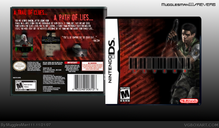
anyways its an original idea by me, you can see more detail on the "rate the game idea above you" thread. Chris Redfield is there because he looks cool and i think it fits. i used dementium screens cause its a survival horror. once again, comments and favs are well appreciated :)
It's nice. I agree with Aryon though, take the strike effect of the character on the front. The back also feels like it's missing something. I can't put my finger on it exactly, but it feels empty.
 Reverb Box Cover Comments
BOX #40!!!!! yay!!!!
anyways its an original idea by me, you can see more detail on the "rate the game idea above you" thread. Chris Redfield is there because he looks cool and i think it fits. i used dementium screens cause its a survival horror. once again, comments and favs are well appreciated :)
[ Reply ]
It's really cool.
[ Reply ]
#2 thanks. anyone else?
[ Reply ]
NickTendo, Priceless.
[ Reply ]
anyone else....come on guys.
[ Reply ]
Good box, and you just had to be like me didn't you, your nicktendo logo is nice but my brettendo logo is nicer
[ Reply ]
#6 yeah i know, it is, but i just couldn't resist
[ Reply ]
It's okay, I really like the logo (I found a site with the font on it and I was inspired!) So nice one.
[ Reply ]
#8 thnks
[ Reply ]
Great job, but i suggest deleting the stripe-effect on the character on the front.
Faved anyways.
[ Reply ]
It's nice. I agree with Aryon though, take the strike effect of the character on the front. The back also feels like it's missing something. I can't put my finger on it exactly, but it feels empty.
[ Reply ]