yes , it said in the wip heavily edited? i can see a couple brushes were used , what else? just looks like a wallpaper and a brush slapped here and there to me , every cover looks better with a back , will wait to see it.
|This is amazing mm111, soon you're going to be considered as a top-artist here.
i'd suggest not using such a big outer glow on the back text,keep it subtle.
maybe a 30-60% opacity 3-4px outer glow[ black or grey ] might look better.
hey guys, if you like it, fav it, i dont mind. its just that knowing people think this is my best helps me strive forward in being a boxartist. thanks :)
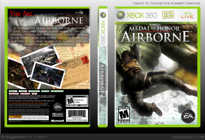
 Medal Of Honor: Airborne Box Cover Comments
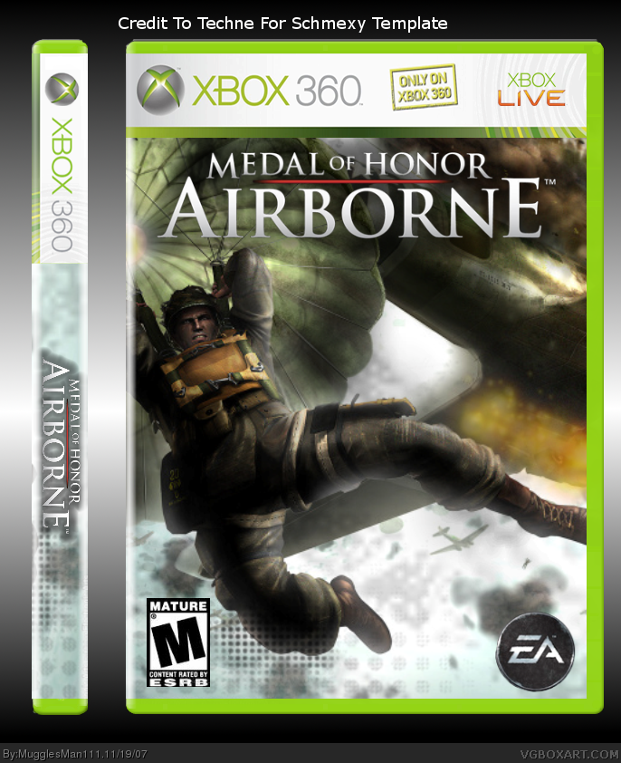
here a new box from me! credits on the box. and if enough of you like it, ill make a back. once again, comments and favs are welcome. :)
[ Reply ]
3 words: MAKE A BACK! This is really cool. 5/5 +fav!
[ Reply ]
Nice! Good job
[ Reply ]
anyone else have anything to suggest b4 i finish the back?
[ Reply ]
yes , it said in the wip heavily edited? i can see a couple brushes were used , what else? just looks like a wallpaper and a brush slapped here and there to me , every cover looks better with a back , will wait to see it.
[ Reply ]
UPDATE: i added a back. let me know what you think...
[ Reply ]
do you guys think it looks better now?
[ Reply ]
Really nice. Maybe need on more screen and a better font for the tagline.
Edited at 1 decade ago
[ Reply ]
#8 thanks, ill work on it
[ Reply ]
Great job =D
You're improving really fast
Keep it up! :) +fav
Edited at 1 decade ago
[ Reply ]
#10 thanks dude, that means alot
[ Reply ]
#11, Just a tip though. The tagline font doesn't fit, I suggest a more simpler yet stylish font that fits like Times New Roman or Trajan Pro.
[ Reply ]
#12 im already working on that but would you suggest a different text for the description?
[ Reply ]
#13, I think Trajan Pro or Traveling Typewriter.
Edited at 1 decade ago
[ Reply ]
#14 ok thanks, im almost done.
[ Reply ]
UPDATE: i changed the tagline and description text, and added a screen, hows it now?
[ Reply ]
"You are...Airborne" what a tagline for this game. hahah :)
[ Reply ]
#17 hey, come on shady...what you think of the box
[ Reply ]
I'm impressed MugglesMan111
[ Reply ]
faved. You improved fast. Keep up the good work and thanks for the tips ^^
[ Reply ]
#19 impressed enough to fav....hmmmmmmm. anyways thanks bro
#20 no prob, and thanks for the fav
Edited at 1 decade ago
[ Reply ]
#18, i think it looks really good, you did a fantastic job!
[ Reply ]
#22 holy s**t i think i just...whoa! you have no idea what tht means to me...
Edited at 1 decade ago
[ Reply ]
thanks to everyone for the favs so far. i would love some more feedback
[ Reply ]
|This is amazing mm111, soon you're going to be considered as a top-artist here.
i'd suggest not using such a big outer glow on the back text,keep it subtle.
maybe a 30-60% opacity 3-4px outer glow[ black or grey ] might look better.
hope that made sense btw.
Faved.
[ Reply ]
#25 wow! thanks dude. ill try to work on that.
YAY! 8 favs *does a lil dance*
Edited at 1 decade ago
[ Reply ]
"out of the ashes of spam, we rise"
any more suggestions peoples?
[ Reply ]
*plays the song from titanic*
sigh.....
i could really use help cause i wanna make this better
Edited at 1 decade ago
[ Reply ]
Really nothing I can suggest, except that the red on "You are" looks weird. I agree, you're getting a LOT better.
[ Reply ]
#29 thanks dude you are too....well my 40th box is coming up soon and im gonna save it for winterfest so watch out for that. and woot! 9 favs
[ Reply ]
Haha, good luck in that. Hope we both make it far. ^.^
I'ma go bump your Logan's Shadow box now... The Hall is calling...
[ Reply ]
thanks dude, i think this is my best box IMO, anyone else think so?
[ Reply ]
#32, ME
I love it and thanks for the contribution to the thread ;)
bloodied envelopes = awesome :)
[ Reply ]
#33 hells yea LK if you need any more blood brushed inaniment objects, im your guy.
[ Reply ]
only 9 more favs guys, maybe it can happen this time...
[ Reply ]
You need to fix up that template but other than that its great.
[ Reply ]
#36 a fav from trevownz......*faints*
keep 'em comin guys
[ Reply ]
YAY! A WINNER IS YOU!
[ Reply ]
#38 wow ummm......thanks?
[ Reply ]
hey guys, if you like it, fav it, i dont mind. its just that knowing people think this is my best helps me strive forward in being a boxartist. thanks :)
[ Reply ]
Muggle, where did you get the front art ? Is there more ?
[ Reply ]
#42 i found it on google then edited it...i guess you could try searching
[ Reply ]
Us FTW.
[ Reply ]
#43 huh? anyways 8 more favs :(
[ Reply ]
This should get in the Hall just cause it's a mark of how drastically you've improved as an artist.
[ Reply ]