[ Box updated on November 17th, 2007 ] [ original ]
 Tom Clancy's Ghost Recon: Advanced Warfighter 2 Box Cover Comments
Comment on xIAMHUNTERx's Tom Clancy's Ghost Recon: Advanced Warfighter 2 Box Art / Cover.
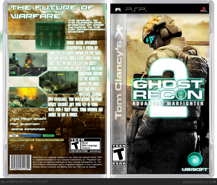
Credit to jevangod for the shmexy template...
[ Reply ]
This is all around awesome. From the shmexy Ubisoft logo to the outstanding back. 5/5 +fav. Glad to see you're still making boxes.
[ Reply ]
^____^ Thanks!
[ Reply ]
Oh, and credit to Mugglesman for (most of) the information on the back.
[ Reply ]
#4 yea, thats right *pumps*
sweet box, faved :8)
[ Reply ]
Really nice HOF material
[ Reply ]
Much appreciated, guys!
[ Reply ]
Yet another good one
You are getting awesome
5/5 FAVED
[ Reply ]
You don't know how much that comment meant to me. ^.^
[ Reply ]
sheesh people it isn't that good. the Tom Clancy sidebar is extremely blurry, the "2" in the logo has some cutting flaws (along with the temp I think. and I don't think the sypnosis font fits the game very well.
3.5/5
[ Reply ]
the tom clancy banner on the side is really blurry compared to the rest of the box. other than that, is very good. 4/5 #10, oh, you just commented before me!
Edited at 1 decade ago
[ Reply ]
#10, Well, at least you were honest. Thanks.
[ Reply ]
Fixed the Clancy sidebar; credit to Lodocovik for that. Working on the logo now.
[ Reply ]
#10, i agree. it's still cool, though. back text is a lil hard to read.
[ Reply ]
I'll try to fix that in the next update.
[ Reply ]
Pretty cool.
[ Reply ]
Thanks, dude!
[ Reply ]