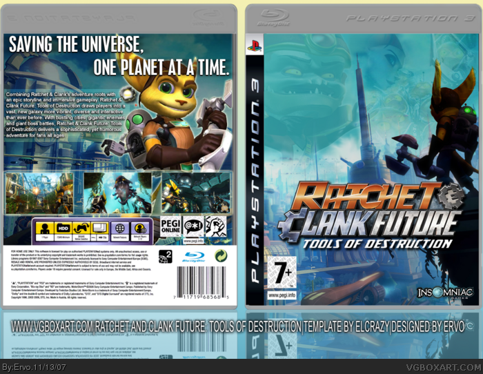
[ Box updated on November 14th, 2007 ] [ original ]
 Ratchet and Clank Future: Tools of Destruction Box Cover Comments
Comment on Ervo's Ratchet and Clank Future: Tools of Destruction Box Art / Cover.
My latest box, and i'm pretty sure that this one will be the last one for a while because internet and mobile companies are starting a strike here in Finland and becuase of that, my internet won't work. Hope y'all like it, i think this is one of my best ones. Special thanks to my buddy ELCrazy, for giving me the temp and showing me his work-in-progress that inspired me. Hope ya fave it.
EDIT: Thanks for the fave, mate!
Edited at 1 decade ago
[ Reply ]
I like it, but I don't really like the font for the tagline.
But still, an excellent job! :)
[ Reply ]
i agree with ELCrazy.
great job.
[ Reply ]
"Saving the WORLD one planet at a time", not a good tagline. First of all, it should say something like "Saving the GALAXY one planet at a time" or "Kicking @$$ one planet at a time" or something like that. I don't really like the choice of a picture for the front, that seems more like a picture to use for the back of the box. 4/5
[ Reply ]
:O
[ Reply ]
#4, What he said. 4/5
[ Reply ]
i dont really like the way u used defused text on the back!
But this box is f-f-f-fabulous
[ Reply ]
#4, Actually it should say saving the universe one planet at a time thats the official one and thats the one I said on my HOF one
[ Reply ]
still a bit too dark, i dont think the logo really needed all that shadow, the text on the back is small and the words on the top back look out of place. but if you look straight forward at this box, its pretty darn good!!!
[ Reply ]
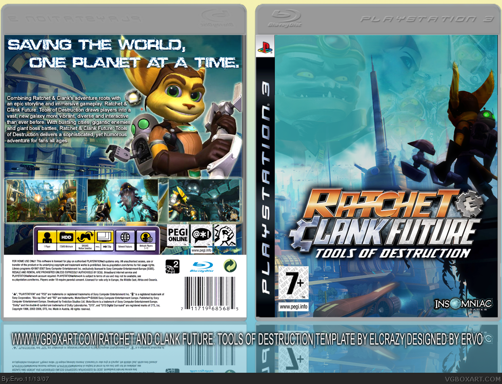
UPDATED! Changed some things, i hope it's better now!
Edited at 1 decade ago
[ Reply ]
#10, i like it beter now
[ Reply ]
:O 5/5 ^^
Edited at 1 decade ago
[ Reply ]
It's pretty nice.
[ Reply ]
Isn't this WickedGamer1's template? Your work is speechless. 5/5
[ Reply ]
It's WG1's casing, but I edited it. I told him to cred WG1/ELCrazy. xD
[ Reply ]
THANKS TO WG1 TOO! i forgot that :D
[ Reply ]
Sweetness.
[ Reply ]