Here's my latest box. My second box for Lineage II. This time, on PS3. The text is a little bit hard to read in small view so, please, take a look at the full and you'll read it perfectly ^^ (except if you're analphabet.). Leave comments pleas :D
awesome. like I said before, you're really good with fronts. the back is good also, but the text is the weak point of this box. still I love the overall design. +fav
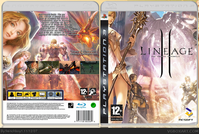
 Lineage II : The Chaotic Chronicles Box Cover Comments
Here's my latest box. My second box for Lineage II. This time, on PS3. The text is a little bit hard to read in small view so, please, take a look at the full and you'll read it perfectly ^^ (except if you're analphabet.). Leave comments pleas :D
[ Reply ]
The text is barely readable with the stroke AND shadow, but not too shabby.
Edited at 1 decade ago
[ Reply ]
#2, read before posting XD Full size, FULL SIZE !!! :p
[ Reply ]
#3, I did go to full size. It's kinda headache-y to read it since the whole box is really bright.
[ Reply ]
i like it, but i agree that the text is hardly readable (even in FULL SIZE:D )
[ Reply ]
awesome. like I said before, you're really good with fronts. the back is good also, but the text is the weak point of this box. still I love the overall design. +fav
[ Reply ]
#6, Thanks ^^
Well, the text, I think this is readable. Even if there is a black stroke around it...
[ Reply ]
the art itself looks really good the only thing I see wrong is the cut on the title, it's a little choppy. other than that I it's a great box.
[ Reply ]
Looks cool.
[ Reply ]