[ Box updated on November 6th, 2007 ] [ original ]
 Ratchet and Clank Future: Tools of Destruction Box Cover Comments
Comment on frenchboy1's Ratchet and Clank Future: Tools of Destruction Box Art / Cover.
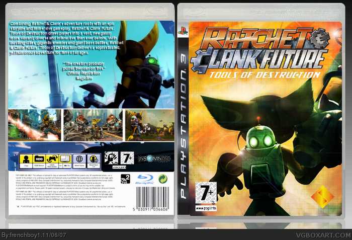
It's really blurry.
[ Reply ]
sorry, but i'm going to be honest. I hate it. The pic on the front is from the original Ratchet & Clank, it's blurry as fuck, the back is hard to read and badly organized, the Sony logo needs text, and the logo is terribly cut out. What happened, man?
[ Reply ]
#2, what happened ? I don't know too, it wasn't so little and blurry before and you could read the text. I saved it, I think, on .gif. Is it that it looks blurry and small ?
Edit : Can E_G or Reed or anyone delete it please ? Because it's really annoying, I'll make another version of this.
Edited at 1 decade ago
[ Reply ]
#3, no need to waste there time, that's what the [Edit Box] feature is thee for. Anyways, I don't like it because it's blurry, and the front isn't the best one, but I don't blame you for using it, it's hard to find many Wallpapers/ Screenshots you can cut up to make a front for this game, they've all been used already. 2/5
Also, you should probably get a better quote than what you've got "The creators probably put all they could into this" doesn't sound so great. ;)
Edited at 1 decade ago
[ Reply ]
#3, Dont save it as GIF save it as PNG
[ Reply ]
#4, yes, the quote wasn't exactly what I meant. I forgot anything with it.
#5, It was just an accident. I'll correct it.
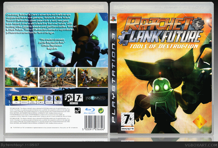
Edit : I've arranged it. This isn't blurry anymore.
Edited at 1 decade ago
[ Reply ]
the thing you said on jevangods box about the text, its all about the presentation. youre text on this box is blantly placed at the top while jevangods is obviously eyecatching. i think youre a great improving artist, but try varying your placement.
[ Reply ]
#7, thanks ^^ I'll try.
[ Reply ]
I dislike the text on the back. Seems to plain to me. I like the rest.
[ Reply ]
Why didn't you add the Insomniac logo on the front? And what's with the first Ratchet and Clank on the cover?
[ Reply ]