My second part of the 'mana' series.
don't ask how many parts it'll get, this might be the last one x].
I'm kinda bummed my last one didn't get thát many comments.
But, here it is. i'd love you to go check it out:http://www.vgboxart.com/view/11996/children.of.mana/?replies=19
this is pretty great!
but some things i dont like are:
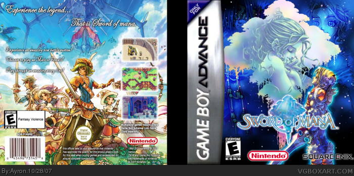
the e logo on the back
theres not that much text on the back
the logo kinda blends in with the background
#3, Well, the E logo should be like that. sorry ^.^'
plus, the game didn't have a real summary, nor could i find a good text or official cover, add to that the limited space i have due to the art.. you do the maths.
And yer, the logo has an outer glow, and i think it's visible enough, and yet does not take away the attention of the art.
and #2, i also HATE Gba boxes. ^.^'
I love the front,but why do you have the characters of Heroes of Mana on the back? I think that the head In the Upper Right corner on the front draws too much attention,but that's just me. And there is almost no text on the back making it look a bit plain.Besides all that I think it deserves 4/5
 Sword of Mana Box Cover Comments
My second part of the 'mana' series.
don't ask how many parts it'll get, this might be the last one x].
I'm kinda bummed my last one didn't get thát many comments.
But, here it is. i'd love you to go check it out:http://www.vgboxart.com/view/11996/children.of.mana/?replies=19
Hope you like it.
[ Reply ]
It needs a spine. Good box though. I'm also not crazy about GBA games or boxes... Don't know why... 4/5
[ Reply ]
this is pretty great!
but some things i dont like are:
the e logo on the back
theres not that much text on the back
the logo kinda blends in with the background
this def deserves a 4/5 though
[ Reply ]
#3, Well, the E logo should be like that. sorry ^.^'
plus, the game didn't have a real summary, nor could i find a good text or official cover, add to that the limited space i have due to the art.. you do the maths.
And yer, the logo has an outer glow, and i think it's visible enough, and yet does not take away the attention of the art.
and #2, i also HATE Gba boxes. ^.^'
Thanks.
[ Reply ]
OH great, sure, don't look at my effort. just let both boxes rot,ok?
[ Reply ]
Looks old school i think. I like it.
[ Reply ]
i like it, looks official on the front, text on the back could be more but im faving anyway
[ Reply ]
Thanks mm11, i just made the choice not to put alot of text on the back, to stay as close to the original as possible.
[ Reply ]
I love the front,but why do you have the characters of Heroes of Mana on the back? I think that the head In the Upper Right corner on the front draws too much attention,but that's just me. And there is almost no text on the back making it look a bit plain.Besides all that I think it deserves 4/5
Edited at 1 decade ago
[ Reply ]
#9, heroes of mana?
the head on the front should draw SOME attention.
it's not too obvious imo.
ty.
[ Reply ]
Hey look! A head in the corner!
Edited at 1 decade ago
[ Reply ]
#11, Hey look! a useless comment =.= rofl.
[ Reply ]
#10 Heroes of Mana is a DS game, that was realised shortly after Children of Mana or at least I think it was.
[ Reply ]