I would fav if it had a more 'Orange' and less brown background. But from the comments it looks as if it actualy did have a more orange backgrond at one point...
Also, if you want to add anything Portal related to the front, a Companion cube would be perfect.
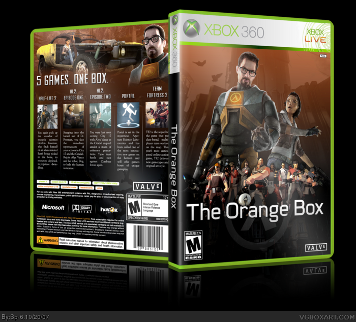
 The Orange Box Box Cover Comments
That's AWESOME!!!!
[ Reply ]
its amazing, im faving it
[ Reply ]
Better then the official box.
[ Reply ]
three faves already!
well knowing me ill make it 4
[ Reply ]
5 !
[ Reply ]
sweet! a lighter orange would be kool, Fav
Edit: and a 6
Edited at 1 decade ago
[ Reply ]
Holy crap this is sweet
[ Reply ]
Very pretty.
[ Reply ]
Amazing quality and looks so official.
[ Reply ]
This needs to be in the HoF. Like NOW!
[ Reply ]
im glad you like it.
[ Reply ]
What about Portal?
[ Reply ]
Secks.
[ Reply ]
#12, what about it? it's on there...
[ Reply ]
#14, No on the front, it's only about TF2 and Episode 2...
[ Reply ]
#15, i don't think there is much material for Portal. I haven't seen anyway, for that matter...
[ Reply ]
i agree that portal should be on the front, but i found only the official logo and useless screenshots.
[ Reply ]
FOUR MORE FAVES AND IT'S IN...!
[ Reply ]
YES! It's in!
Edited at 1 decade ago
[ Reply ]
Wow.. i should really start paying attention to the newer artists o.o'
Faved, and gratz on your HoF!
[ Reply ]
Congrats on the Hall! Well deserved. Hopefully your Skate box will be next.
[ Reply ]
really nice job, and congrats on HoF.
i saw the official box for this today in the store it's UBERBLEGH compared to this.
[ Reply ]
my first box in hof, thank you all:)
[ Reply ]
You could add a portal under the orange box words so all of the things would be on the front
Edited at 1 decade ago
[ Reply ]
I dont like it. The comical characters from TF looks ugly together the realistic characters (Freeman & Alyx).
But, the back its very cool.
[ Reply ]
Very cool.
[ Reply ]
Finally in the Hof. Congrats!
[ Reply ]
#25, Everything is awesome. link
[ Reply ]
There is nothing bad to say about this. Amazing 5/5
Edited at 1 decade ago
[ Reply ]
5/5 Only thing I see wrong is portal is rated T so it should say T-M but it's better than I could ever do. And I agree with #3.
[ Reply ]
I would fav if it had a more 'Orange' and less brown background. But from the comments it looks as if it actualy did have a more orange backgrond at one point...
Also, if you want to add anything Portal related to the front, a Companion cube would be perfect.
Edited at 1 decade ago
[ Reply ]