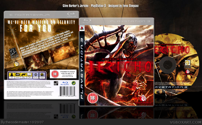
With this new box, Clive Barker's Jericho, I was aiming to get across to you, the viewers, that you're looking at a sleeve for a game placed within the 'horror' genre.
Estimated time of completion: 4 hours (and a bit)
Please post a comment and tell me what you think of it.
EDIT#1: Thanks! It means a hell of a lot to me!
EDIT#2: I'm really slow typing because I'm on my PS3 =)
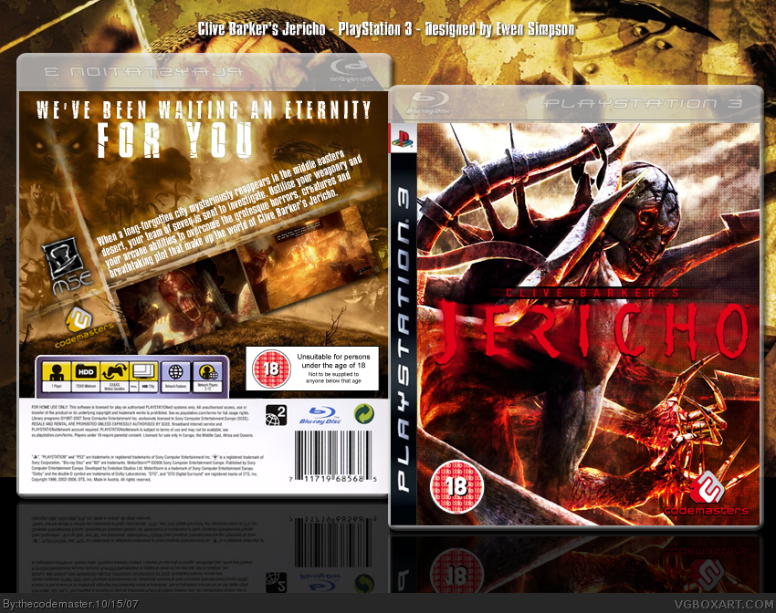
I'm going to make the logo layer a slightly deeper colour to make it stand out. The blur I might dim down a bit, but I'm going to keep it.
E_G, the description on the back I'll probably add a gentle black outer glow to make it stand out a little.
Thanks for all your comments. More are still welcome :D
Updated to VERSION 3. The most times I have EVER updated a box =D
Changes:
Obviously the addition of a disk to the right hand side.
The quality seems quite low to me, especially compared to the document I have opened. I think I might upload it later as a PNG and see if that inmproves the quality =(
The logo is a bit hard to see, and the back feels a bit empty with only two screenshots, but it's a nice design. The text on the back and the back background look awesome.
Wow. That's just... Awesome. You just never stop spewing out these quality boxarts, you should really consider getting a job (or work experience) at a graphics design company, you'd go really far.
 Clive Barker's Jericho Box Cover Comments
this is horrible!!! in a good way
it is awesome, it looks...im speechless
5/5+fav...of course
[ Reply ]
With this new box, Clive Barker's Jericho, I was aiming to get across to you, the viewers, that you're looking at a sleeve for a game placed within the 'horror' genre.
Estimated time of completion: 4 hours (and a bit)
Please post a comment and tell me what you think of it.
EDIT#1: Thanks! It means a hell of a lot to me!
EDIT#2: I'm really slow typing because I'm on my PS3 =)
Edited at 1 decade ago
[ Reply ]
great, like always, but i don't really like the reddish glow arund th logo.
[ Reply ]
real good. great job, front is sweet and so is back. perhaps one more screenshot?
[ Reply ]
Very nice, I think it'd be better if you added a black stroke on the description to make it stand out more.
[ Reply ]
It's hard to see the logo.... I tink it might look better with a different colored glow/stroke around it...?
[ Reply ]
I'm going to make the logo layer a slightly deeper colour to make it stand out. The blur I might dim down a bit, but I'm going to keep it.
E_G, the description on the back I'll probably add a gentle black outer glow to make it stand out a little.
Thanks for all your comments. More are still welcome :D
[ Reply ]
Feel free to go ahead and make those changes... XD
[ Reply ]
*UPDATE TO VERSION 2*
Changes:
Clearer outer glow on description to rear, making it more visible.
Logo on front is brighter/deeper in colour with gradient overlay.
View in Full.
[ Reply ]
awesome, probably your best box yet 5/5
[ Reply ]
This box is sick! I have no idea what it is and it scareas the living crap outta me but 5/5 well done!
[ Reply ]
Nice update +fav.
[ Reply ]
very nice back cover , not too sure if i like the front yet though , but might grow on me , i'll have to keep looking.
[ Reply ]
Fugging awesome-o.
[ Reply ]
This DESERVES to be in the HoF.
[ Reply ]
9 or so more favourites and it's there! =D
Edited at 1 decade ago
[ Reply ]
Yeah, this is really good, but the template kind of holds it back a little...
[ Reply ]
Updated to VERSION 3. The most times I have EVER updated a box =D
Changes:
Obviously the addition of a disk to the right hand side.
The quality seems quite low to me, especially compared to the document I have opened. I think I might upload it later as a PNG and see if that inmproves the quality =(
Edited at 1 decade ago
[ Reply ]
The logo is a bit hard to see, and the back feels a bit empty with only two screenshots, but it's a nice design. The text on the back and the back background look awesome.
[ Reply ]
#19, Thanks Koopa... I'm forever in your debt... =D
I think the logo trouble is due to the slightly blurry quality of the JPEG. I'm updating to a higher quality PNG now.
Edited at 1 decade ago
[ Reply ]
Sorry for the double post but...
VERSION #4
Quality changed
[ Reply ]
Wow. That's just... Awesome. You just never stop spewing out these quality boxarts, you should really consider getting a job (or work experience) at a graphics design company, you'd go really far.
5/5 + fav.
-J
Edited at 1 decade ago
[ Reply ]
Awesome, thanks for the +FAV too!
[ Reply ]
the back of this one's even better! zomg ;)
again, +Fav
[ Reply ]