1. Never have a one wallpaper for the whole box, use a different one for the front
2. Wht T, sems more e-ish
3. Can i have the paper thing you used on the back, the one starts with your favorite hero, but without the text, just pm it to me and i'll give you credit for it on my next box
Thanks #2!
#3,
1. I wanted it to have the feel to it that it goes from front to back...
2. I can never find an E logo for the back.
3. You just have to go to google images and type parchment. It's the first thing you see. Well, for me it was. Just turn it to how you like.
#6, thanks. That's what my dad told me honestly, I like him there.
#7, I know. I had that feeling throughout making the box, but I couldn't find a good enough filter.
#8, and #9, thanx.
#10, how?
#11, Oops. About the logo. It's perfectly cut out. Do you mean the white boxes around the letters? If you look closely You'll tell that's papers. It's part of the logo. Or do you mean the spine? That's a stroke.
I see two problems.
1 - Nintendo wouldn't put a quote saying that paper mario wasn't good.
2 - "Just when you THOUGH zelda couldn't get any better..."
Awesome box still. 4.9/5 and a fav =P I just hope you fix these problems.
 Super Paper Zelda Box Cover Comments
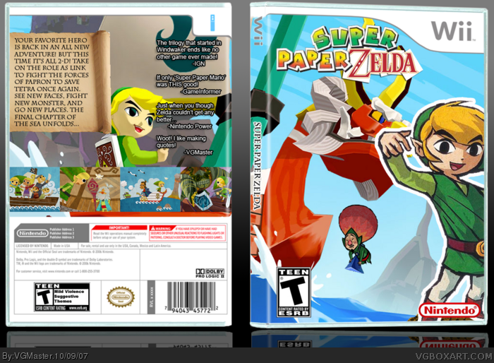
If Windwaker was a trilogy, this is #3. I had the idea, so I worked with it. I think it turned out well. Please view in full.
Comments are totally appreciated.
[ Reply ]
That's genius! I love the way you used the screenshots. 5/5 +Fav!
[ Reply ]
very nice box but complaints
1. Never have a one wallpaper for the whole box, use a different one for the front
2. Wht T, sems more e-ish
3. Can i have the paper thing you used on the back, the one starts with your favorite hero, but without the text, just pm it to me and i'll give you credit for it on my next box
nice job
[ Reply ]
Thanks #2!
#3,
1. I wanted it to have the feel to it that it goes from front to back...
2. I can never find an E logo for the back.
3. You just have to go to google images and type parchment. It's the first thing you see. Well, for me it was. Just turn it to how you like.
[ Reply ]
4.5/5
[ Reply ]
I don't like how link is cut off on the cover. Besides that great job.
[ Reply ]
Doesn't look like paper.. lol
[ Reply ]
I love your quote on the back.
[ Reply ]
nice concept, but yeah i agree with trev, though the screenshots kinda do.
[ Reply ]
your reflection is screwed up just to let you know.
[ Reply ]
'Thought' is spelled wrong on the back, and the 'Zelda' letters are badly cut out on the front. Ohter than that it's pretty nice.
[ Reply ]
#6, thanks. That's what my dad told me honestly, I like him there.
#7, I know. I had that feeling throughout making the box, but I couldn't find a good enough filter.
#8, and #9, thanx.
#10, how?
#11, Oops. About the logo. It's perfectly cut out. Do you mean the white boxes around the letters? If you look closely You'll tell that's papers. It's part of the logo. Or do you mean the spine? That's a stroke.
[ Reply ]
#12, your reflection should look like link
[ Reply ]
awesoooooooooooooooome!
1,000,000/1,000,000
[ Reply ]
I see two problems.
1 - Nintendo wouldn't put a quote saying that paper mario wasn't good.
2 - "Just when you THOUGH zelda couldn't get any better..."
Awesome box still. 4.9/5 and a fav =P I just hope you fix these problems.
[ Reply ]
Awesome!!! 5/5
Edited at 1 decade ago
[ Reply ]
4/5
[ Reply ]
this is bad...*ss
[ Reply ]
#3, your third one is not a complaint
[ Reply ]