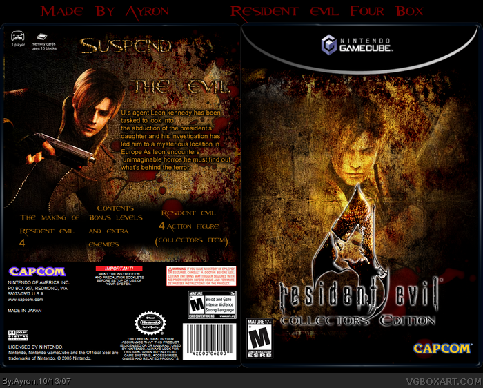
[ Box updated on October 13th, 2007 ] [ original ]
 Resident Evil 4 Collector's Edition Box Cover Comments
Comment on Ayron's Resident Evil 4 Collector's Edition Box Art / Cover.
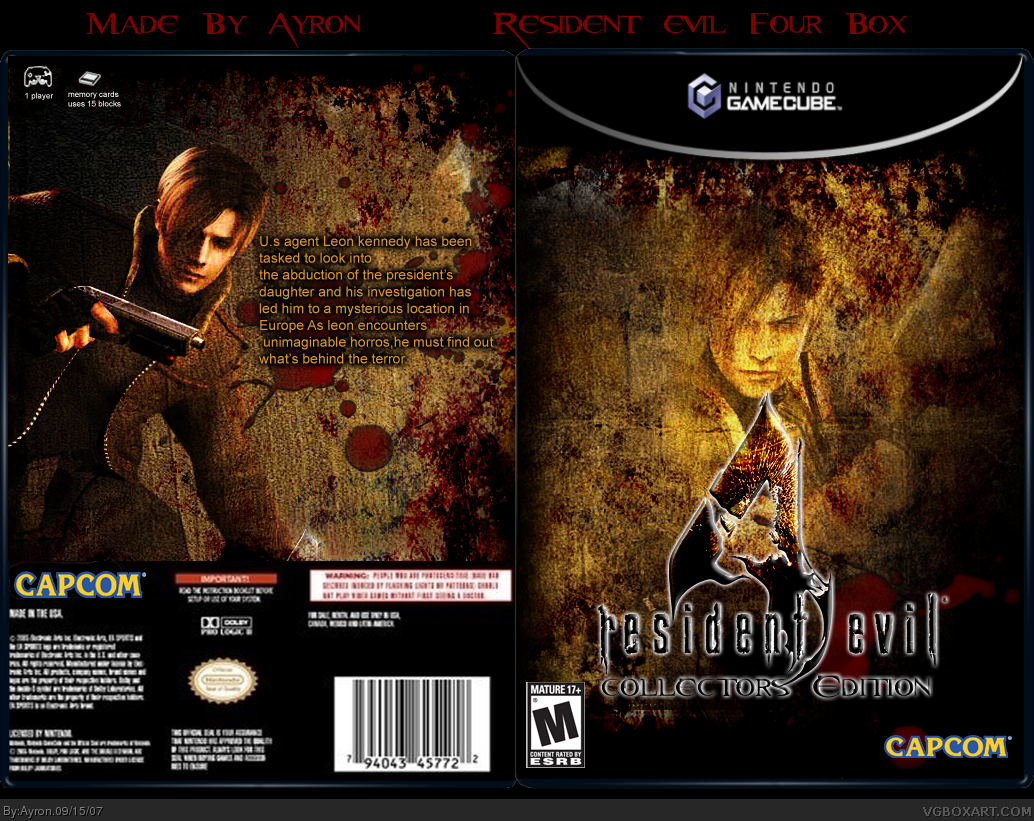
[ Box updated on October 13th, 2007 ] [ original ]
Comment on Ayron's Resident Evil 4 Collector's Edition Box Art / Cover.
My Re4:Cd box,
i hope you like it,
Don't go saying,"it's too dark" because i felt like the game was like that.
Comments are appreciated
[ Reply ]
Nice but you could use some more stuff on the back it looks a bit empty
[ Reply ]
#2, well yeah, i did that because it's a collectors edition, when you buy it, you already know what the game's about.
[ Reply ]
I see a 4 beside leons hand on the back
[ Reply ]
#4, thanks,i'll edit that away tomorrow, and i might add some screens and a catch-phrase to make it look more complete
[ Reply ]
I understand what you're trying to do but it doesn't look good on the back. Since it's collectors edition add a table or something showing what the special features are or something? As of right now 3.5/5, haha sorry but it needs some WORKRKRKRKRKR!
Edited at 1 decade ago
[ Reply ]
#6, read comment #5.
[ Reply ]
Update, tried to fix the major flaws.
comments are appreciated.
[ Reply ]
Nice work. It must of taken ages with all the detail.
[ Reply ]
Do you want a resident evil game font instead of that movie font? I could send it to you in msn :D
[ Reply ]
#10, no, i'm cool. thanks though.;)
and ty #9, yeah, the effects had me sitting down a while.;)
[ Reply ]
I like it, very dangerous looking. Great work!
[ Reply ]
#12, thanks =]
[ Reply ]
Im working on a collector`s edition too
[ Reply ]
If your going to use a text on the back dont let it be the movie text it doesnt look right
[ Reply ]
#15, -sigh- that's a late comment, it looks good imo.
[ Reply ]
I like this. Good one.
[ Reply ]
#17, thanks alot adfd
[ Reply ]
Nice shit could use some screens though >.> but its cool
[ Reply ]
#19, rofl, ty,
but Collectors editions usually don't have screens.
[ Reply ]
#20....true, but they are usually tin boxes too. besides...just think how much awesome"r" this would be with screenshots on the back in place of the text. i like the new logo arrangement btw ;)
[ Reply ]
#20, some do, like King Kong, Tomb Raider Anniversary and DMC3 special editions
[ Reply ]
Nice 5/5.
[ Reply ]
#21, lol, ty.
#22, yeah k, but this one doesn't.. at the moment.x]..
besides, if i want to update this, i've got to update Mario hoops, SC3 etc first...
why?.....
because i want to :P
Ty #24, but please, don't double-post.
[ Reply ]
awesome front,back needs some editing though 4.5/5
[ Reply ]
#25, ty..
[ Reply ]
Wah ! Awesome job !
5/5 +faved
I love it
[ Reply ]
Update!
added other back template--credit to chibi cloud
[ Reply ]
Thats nice but why dont you stay with the same text (the small word text) instead of switching it to the Resident Evil movie text
[ Reply ]
#29, it looks more evil, that's why.
well, this box will rust away now, farewell :P
[ Reply ]
Absolutely love it this way! 5/5 + fav ,because it has an Action Figure Included :P
[ Reply ]
#31, LOL! thanks.xD
[ Reply ]
d00d, how did I miss this?
WTFGASM!!!/5
[ Reply ]
#33, roflmao! i have absolutely no clue.
it just shows how my rating on this site really is ^^'
[ Reply ]
How did I miss this ? 15th favorite of course !
[ Reply ]
#35, thanks mate.
i don't know, but please browse my author's page once in a while.
to make sure you didn't miss anything? ;)
[ Reply ]