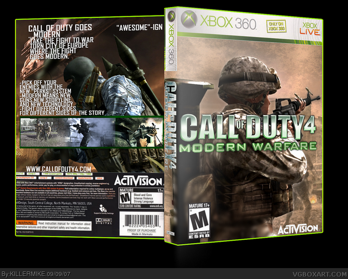
I honestly think it isn't that great. the logo is covering the guys face, the activision logo is too big, and it's kinda plain. and thats JUST the front. the back is really bad. the text covers up most of the guy and is really big, I can't tell what the backround is. it's a mess.
and since when are website names and quotes bigger then the summary text and header?
2/5
 Call of Duty 4 Box Cover Comments
no comments?
Edited at 1 decade ago
[ Reply ]
Yo I like it 4 out of 5. Go check out my Residen tEvil 4 collectors eddition. I updated it.
[ Reply ]
#2, NNNNIIIICCCCEEEE!!!
[ Reply ]
ive really improved!!!
[ Reply ]
SOMEONE COMMENT ALREADY!!!!!!!!!*caps*!!1
[ Reply ]
I honestly think it isn't that great. the logo is covering the guys face, the activision logo is too big, and it's kinda plain. and thats JUST the front. the back is really bad. the text covers up most of the guy and is really big, I can't tell what the backround is. it's a mess.
and since when are website names and quotes bigger then the summary text and header?
2/5
[ Reply ]
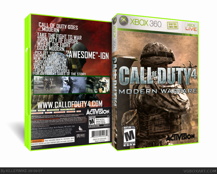
I don't like the text on the back its so large and close together.
[ Reply ]