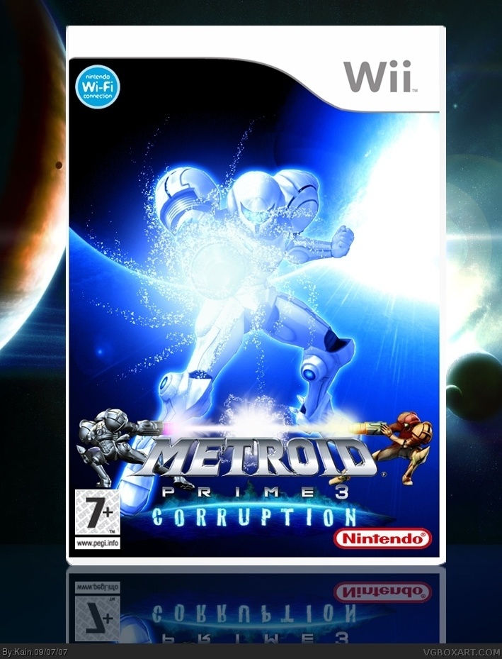
Personally I would've liked version 1 (with the correct rating and without the wif-fi logo) because the logo placement was better and I'd personally ditch the two samus(es) below.
It's awesome but ff the part that says Metroid could be smaller it would give more space or make the white samus a bit smaller. But other then that I love it. The small samuses actually give it a different touch and not the typical box art.
Why does Everyone hate the Samuses at the bottom??? I love 'em!!! great box
The one thing that's on my mind... What is that black splotch on the planet to the left???
 Metroid Prime 3: Corruption Box Cover Comments
my firsy metroid box, it looks better full screen :)
[ Reply ]
OOOOOOOOHHHHH......Nice....but I don't think those little samuses ar not so necessary.
[ Reply ]
that's really awesome. i love the 2 samus' at the bottom. a couple of things that bug me, though.
1. the logo is way too far down.
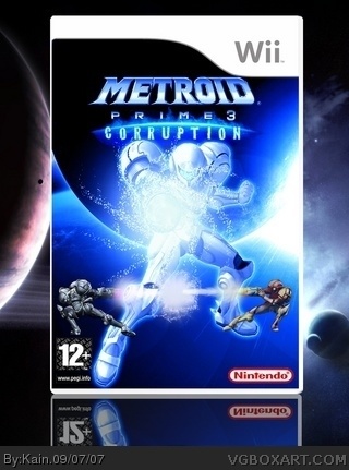
2. it should be rated 12+
3. the game doesn't have wi-fi
4. it looks a bit too bright
4/5
[ Reply ]
updated:)
[ Reply ]
Pretty :D
[ Reply ]
Personally I would've liked version 1 (with the correct rating and without the wif-fi logo) because the logo placement was better and I'd personally ditch the two samus(es) below.
But this looks very cool, anyway. :)
[ Reply ]
I like the 2 Samuses, but the logo needs a new place. Maybe move the main Samus up more and center the logo?
[ Reply ]
It's awesome but ff the part that says Metroid could be smaller it would give more space or make the white samus a bit smaller. But other then that I love it. The small samuses actually give it a different touch and not the typical box art.
[ Reply ]
OOOOOHH I really love it. Those two samus are amazing lol
[ Reply ]
I like this one.
[ Reply ]
I love the Blue color theme!! Nice box!
[ Reply ]
I like this... But the little Samuses at the bottom look kinda dumb... 4.5/5
[ Reply ]
Why does Everyone hate the Samuses at the bottom??? I love 'em!!! great box
The one thing that's on my mind... What is that black splotch on the planet to the left???
[ Reply ]