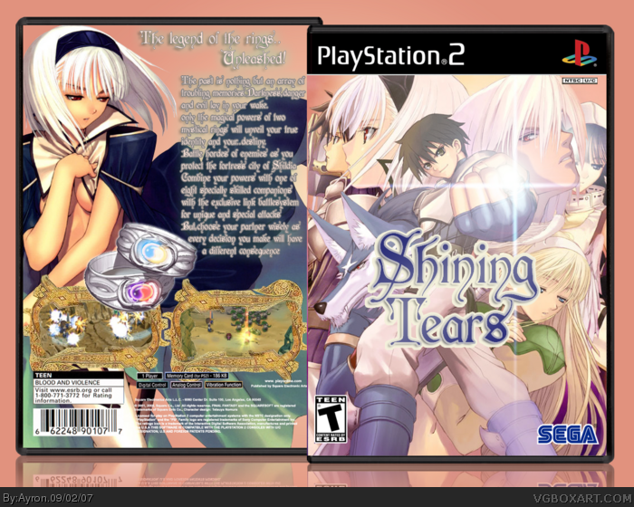
Welcome to the third[?] Shining Tears box on this site.
My own 'shining tears' logo, so don't come saying:'HEY, that's not the official logo!', or 'the front is just a wallpaper, this box is effortless', take a closer look if you do.
Hope you like it!
Pretty good. I just don't like the background, way too flashy for my tastes. I'd do a gradient with the same color, but that's just my personal preference. 4/5
#15, Well I'm not quite back yet, it's taking my Internet Provider longer to transfer it than I expected. So I'm using my friend's connection in the meantime.
 Shining Tears Box Cover Comments
Purley awesome 4.5/5
Edited at 1 decade ago
[ Reply ]
Welcome to the third[?] Shining Tears box on this site.
My own 'shining tears' logo, so don't come saying:'HEY, that's not the official logo!', or 'the front is just a wallpaper, this box is effortless', take a closer look if you do.
Hope you like it!
Aww! beaten to the first comment.x] thanks #1.
Edited at 1 decade ago
[ Reply ]
great box, not perfect, but awesome.
[ Reply ]
Pretty good. I just don't like the background, way too flashy for my tastes. I'd do a gradient with the same color, but that's just my personal preference. 4/5
[ Reply ]
#4, which background?
because the back IS a gradient.
[ Reply ]
I think it's really cool. Great job on the logo. Oh, and btw, the girl on the back looks like she's from a hentai flick. Just saying.
[ Reply ]
#6, i know, it's official art though.:P[ look at the front, the big head on the left ]
and i did my best on the logo, so thanks.^^
[ Reply ]
this is very good, stunning! haha very nice job tho, keep it up. :)
[ Reply ]
This is awesome!!! Why no faves yet? Heres one: *FAVE*
[ Reply ]
and for the record me to
[ Reply ]
lol, thanks #8-10.
and #9, i don't know. my work doesn't seem to be liked enough ;).
thanks everyone for comments/Favs
[ Reply ]
Just a question, do you guys think the contrast on the front is too big?
[ Reply ]
I like it but overall it seems a little too bright. If you added the official logo, it would look better to me.
[ Reply ]
#13, yeah, if you could give me the official logo, i'd be glad to update E_G.
[ Reply ]
@#13, E_G's back?
Ayron, I agree with E_G about using the official logo. You can extract one from a high-res scan of the official box.
Edited at 1 decade ago
[ Reply ]
#15, Well I'm not quite back yet, it's taking my Internet Provider longer to transfer it than I expected. So I'm using my friend's connection in the meantime.
[ Reply ]