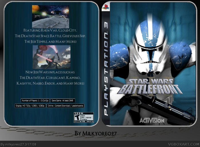
This is a tin Star Wars Battlefront III
Is is NOT just a wallpaper for the front. I like it, I think the design is very good. This took me a few days, and so all I have to say is, job well done ;)
did you not listen to 'me' in the forum???
i said that it looked extremely ugly and if you look at most tin boxes, you will not find an ESRB logo there!
this is a tin oh ok well then take off the back and make a new front because i don't think I've seen a in with a back. maybe its just me. your box is blurry and you know it is but you still don't want to go get the image again in a higher res which would take a hour to remake. stop being lazy about it. if people give you advise then why would you use it.
"live the wars" is badly cut, the title is to small, its all fuzzy/ blurry, the front clone trooper is stretched, and the back is too plain. also says "rhen var" twice.... 1/5
I knew this had to be updated, so it looks way better now. Credit to Wickedgamer1 and Radioacrive Box for templates, and Google Images for the pictures
 Star Wars: Battlefront III Box Cover Comments
This is a tin Star Wars Battlefront III
Is is NOT just a wallpaper for the front. I like it, I think the design is very good. This took me a few days, and so all I have to say is, job well done ;)
[ Reply ]
5/5 good
Edited at 1 decade ago
[ Reply ]
Dev. and editor logo missing, SW : BIII logo too small. Back too empty.
2/5
[ Reply ]
#2, This is definetly not 5/5 (no offence oreo)
I don't like the text, it's plain and wth; happened
to the template, it's roughly cut.
[ Reply ]
its ok
ill change the back a bit right now
with the letters, I want to change them but I did not save the original copy of this (bad me...)
Edited at 1 decade ago
[ Reply ]
did you not listen to not listen to me in the forum??? i said to put your logos and ESRB.
[ Reply ]
did you not listen to 'me' in the forum???
i said that it looked extremely ugly and if you look at most tin boxes, you will not find an ESRB logo there!
next time, please read what a write
[ Reply ]
this is a tin oh ok well then take off the back and make a new front because i don't think I've seen a in with a back. maybe its just me. your box is blurry and you know it is but you still don't want to go get the image again in a higher res which would take a hour to remake. stop being lazy about it. if people give you advise then why would you use it.
[ Reply ]
Bad. Is just a wallpaper from the movie the front how come is not??? It is you can't fool a star wars fan. Full noisy dots stuff. Plain text.
[ Reply ]
"live the wars" is badly cut, the title is to small, its all fuzzy/ blurry, the front clone trooper is stretched, and the back is too plain. also says "rhen var" twice.... 1/5
[ Reply ]
if its a tin......then i think its great 5/5!!!
[ Reply ]
this is pretty basic. no dev or esrb logos but you can barely see a logo somewhere on the box 4/5
[ Reply ]
the live the wars font is really bad. the back is good. but not great.
[ Reply ]
I knew this had to be updated, so it looks way better now. Credit to Wickedgamer1 and Radioacrive Box for templates, and Google Images for the pictures
[ Reply ]
You might want to make the roman numerals 3 stand out more cuz when i saw it, it said StarWarsBattlefront__...i couldnt see the three basically.
[ Reply ]
#15, no.. i forgot to save it...
Edited at 1 decade ago
[ Reply ]
u spelt naboo wrong
[ Reply ]