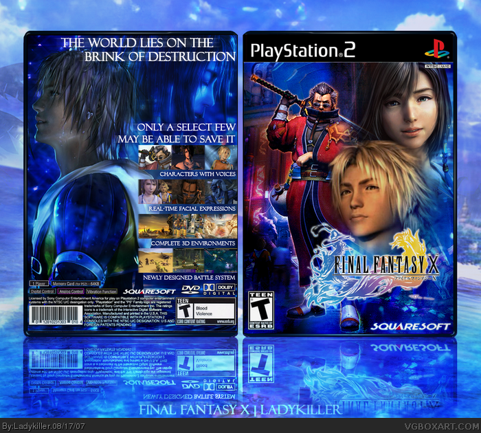
well, I just finished my ffx box (possibly my last box until roboross' contest is over) and I felt I put more time to it than I should've considering I still haven't started on my contest box. other than that, what can I say? this was my very first ps2 game and it brings back a lot of memories as I was making it and now I'm finally finished. best viewed in full and enjoy!
EDIT: credits would go to maybe tomorrow for the perfectly rendered logo and chibi cloud for the cool multicolored game info making it look more official, tnx guys ;)
#8-12, thanks, though looking at it now...I feel like I deviated from the style of the official one, I still think this new style suits it better and still manages to preserve the ffx feel to it :)
i like it and it's pretty but tidus seems blurry compared to the other images, maybe you should've sharpened him.
and i dunno what it is, but the text on the backs seems weird too me...
anyways good job overall.
thanks guys for the comments and favs, #15 I actually thought ffx was really good and #16....err...chinatown? seriously, I'm halfway done with my comp box....yay! :D
thanks for the comments and Hof favs, #19, lol, apparently it was a big deal when it first came out and #18, I just updated with a better and lighter background since the first one was kinda dark, I also sharpened tidus a bit. hope you like it
#24, I know lol...it seems like his head just floats right above the logo XD I had to compromise proper design with the intense urge of including tidus in the front, which I believe won't make it truly ff10-ish. An amateurish mistake, sure. But I'm happy I can reflect on such things to improve :)
3/5. The front cover looks bad, which is what most of the bad points are. Auron is so low-res, and the masking between Tidus, Yuna, and Auron is clearly seen, which is bad. The overall tone of the cover clashes with itself because it's so blue, which contrasts with the game screenshots.
I agree with what you stated about the front, if you read comment #25 especially. Also, this is one of my older work and I've gotten much better since, your crits are appreciated, but I know full well the errors in this box, thanks. I have no intention to update since it remind me of myself when I was still starting too.
Also, it seems like you know what you're talking about the "overall tone" clashing with itself, but you really don't. The blue scheme which is prevalent in the game still feels very balanced for both front and back and goes fine with the screenshots.
hello i spanish so i dont understand everything, but the creator of this image can give me the image to real size, for mi box of the game? sorry if i wrote anything bad, but i spanish ^^
my msn is [email protected]
#33 & #35, I suppose I could make a printable version of this if you guys want. I'll send the printables to both of you once done.
EDIT: To be honest, this is one of my earlier designs and though I've mentioned I have no plans of updating it, I think I'll update it anyway for you guys. I might based the printable on the updated design.
#37, Yeah, thanks for the compliment. I'll send it to your e-mail once finished. I'll update it with the printable version here too.
Yeah, that's pretty much where I got the idea for my avatar. I love that anime. Also, I understand about the traducion. My spanish is alright at best to be honest, so yeah. ;)
One of the better FFX covers on this site but not the best either. It could be, though but not perfect enough for me to want to use it as the actual cover or packaging.
I love the colours and the FLASHY visual style...it has this BAM in your face approach but I don't know...the front is just too cluttered for my tastes and I'D personally NEVER drop the logo to the bottom like that. The blending could have been touched up a bit where Tidus is placed. Something just doesn't seem quite right to me. The logo should always be the focal point - notice how all of the FF covers always had the logo in place where it's the first thing that comes to your attention? Either centered, top center, top right or left.
As for the back??? Well, I'd say it's CLOSE to perfect! It's better than the official one, anyway. EXCELLENT choice of pictures and the composition could not be better except for maybe where the headline is placed. Way too close to the edge for me...it just kinda bothers me a bit hehe. Either shrink it down or lay it out another way...I know you probably didn't want to interfere with the images but there must be another way to work it out.
 Final Fantasy X Box Cover Comments
Nice job 5/5.
[ Reply ]
This is the best Final Fantasy X box. 5/5
[ Reply ]
well, I just finished my ffx box (possibly my last box until roboross' contest is over) and I felt I put more time to it than I should've considering I still haven't started on my contest box. other than that, what can I say? this was my very first ps2 game and it brings back a lot of memories as I was making it and now I'm finally finished. best viewed in full and enjoy!
EDIT: credits would go to maybe tomorrow for the perfectly rendered logo and chibi cloud for the cool multicolored game info making it look more official, tnx guys ;)
Edited at 1 decade ago
[ Reply ]
"Characters with voices"
lol, I expected them to have ham but whatever =P
5/5
[ Reply ]
this game was the greatness, so is this box! +fav!!!!
- thats twice today :D
[ Reply ]
Awesome, looks offical, excellent job with the blending, 5/5 +fav
[ Reply ]
tnx #1-2 & #4-6 and good luck to both brett and rc in the contest, I'll see you guys there ;)
[ Reply ]
AWESOME....deserves to be in the hall of fame
5555555555/5+fav
[ Reply ]
Great job! +fav
[ Reply ]
Very well made.
[ Reply ]
Excellent!!! :)
[ Reply ]
Amazing!!!!!!
I think this is the best one I've seen!
5/5 +fav
[ Reply ]
#8-12, thanks, though looking at it now...I feel like I deviated from the style of the official one, I still think this new style suits it better and still manages to preserve the ffx feel to it :)
[ Reply ]
i like it and it's pretty but tidus seems blurry compared to the other images, maybe you should've sharpened him.
and i dunno what it is, but the text on the backs seems weird too me...
anyways good job overall.
[ Reply ]
Yeah, I agree with ffseer, but still, this is by far the best FFX box on this site. You make the box much better than the actual game Ladykiller +fav.
[ Reply ]
beautiful blue, where have you been?
[ Reply ]
thanks guys for the comments and favs, #15 I actually thought ffx was really good and #16....err...chinatown? seriously, I'm halfway done with my comp box....yay! :D
[ Reply ]
wow 7/5 but the next you should change the color blue in the background
[ Reply ]
ZOMG!! REAL-TIME FACIAL EXPRESSIONS!! IT SO BEATS REAL-TIME WEAPON CHANGE!!
But seriously, this is a really good box. Now I'm having lesser faith in my match against you in the Survival Horror contest.
[ Reply ]
dude this Ownz. great job.
[ Reply ]
thanks for the comments and Hof favs, #19, lol, apparently it was a big deal when it first came out and #18, I just updated with a better and lighter background since the first one was kinda dark, I also sharpened tidus a bit. hope you like it
[ Reply ]
This is very nice . 10/5 +favs
Edited at 1 decade ago
[ Reply ]
this is great man...the reflection thing is sick
[ Reply ]
this is goooood =] ff 10 is my second fav., im just not a big fan of where tidus is, but the back is simply amazing!!
[ Reply ]
#24, I know lol...it seems like his head just floats right above the logo XD I had to compromise proper design with the intense urge of including tidus in the front, which I believe won't make it truly ff10-ish. An amateurish mistake, sure. But I'm happy I can reflect on such things to improve :)
[ Reply ]
OMG! i love FFX, and you have done it justice! well done!
7/5
+fav
[ Reply ]
AWESOME!
[ Reply ]
#19, For massive damage? :P
[ Reply ]
cooooooooooooooooooooooooooooooooooooooooooooooooooooooooooooooooooooooooooooooooooooooooooooooooooooooooooooooooooooooooooooooooooooooooooooooooooooooooooooooooooooooooooooooooooooooooooooooooooooooooooooooooooooooooooooooooooooooooooooooooooooooooooooooooooooooooooooooooooooooooooooooooooooooooooooooooooooooooooooooooooooooooooooooooooooooooooooooooooooooooooooooooooooooooooooooooooooooooooooooooooooooooooooooooooooooooooooooooooooooooooooooooooooooooooooooooooooooooooooooooooooooooooooooooooooooooooooooooooooooooooooooooooooooooooooooooooooooooooooooooooooooooooooooooooooooooooooooooooooooooooooooooooooooooooooooooooooooooooooooooooooooooooooooooooooooooooooooooooooooooooooooooooooooooooooooooooooooooooooooooooooooooooooooooooooooooooooooooooooooooooooooooooooooooooooooooooooooooooooooooooooooooooooooooooooooooooooooooooooooooooooooooooooooooooooooooooooooooooooooooooooooooooooooooooooooooooooooooooooooooooooooooooooooooooooooooooooooooooooooooooooooooooooooooooooooooooooooooooooooooooooooooooooooooooooooooooooooooooooooooooooooooooooooooooooooooooooooooooooooooooooooooooooooooooooooooooooooooooooooooooooooooooooooooooooooooooooooooooooooooooooooooooooooooooooooooooooooooooooooooooooooooooooooooooooooooooooooooooooooooooooooooooooooooooooooooooooooooooooooooooooooooooooooooooooooooooooooooooooooooooooooooooooooooooooooooooooooooooooooooooooooooooooooooooooooooooooooooooooooooooooooooooooooooooooooooooooooooooooooooooooooooooooooooooooooooooooooooooooooooooooooooooooooooooooooooooooooooooooooooooooooooooooooooooooooooooooooooooooooooooooooooooooooooooooooooooooooooooooooooooooooooooooooooooooooooooooooooooooooooooooooooooooooooooooooooooooooooooooooooooooooooooooooooooooooooooooooooooooooooooooooooooooooooooooooooooooooooooooooooooooooooooooooooooooooooooooooooooooooooooooooooooooooooooooooooooooooooooooooooooooooooooooooooooooooooooooooooooooooooooooooooooooooooooooooooooooooooooooooooooooooooooooooooooooooooooooooooooooooooooooooooooooooooooooooooooooooooooooooooooooooooooooooooooooooooooooooooooooooooooooooooooooooooooooooooooooooooooooooooooooooooooooooooooooooooooooooooooooooooooooooooooooooooooooooooooooooooooooooooooooooooooooooooooooooooooooooooooooooooooooooooooooooooooooooooooooooooooooooooooooooooooooooooooooooooooooooooooooooooooooooooooooooooooooooooooooooooooooooooooooooooooooooooooooooooooooooooooooooooooooooooooooooooooooooooooooooooooooooooooooooooooooooooooooooooooooooooooooooooooooooooooooooooooooooooooooooooooooooooooooooooooooooooooooooooooooooooooooooooooooooooooooooooooooooooooooooooooooooooooooooooooooooooooooooooooooooooooooooooooooooooooooooooooooooooooooooooooooooooooooooooooooooooooooooooooooooooooooooooooooooooooooooooooooooooooooooooooooooooooooooooooooooooooooooooooooooooooooooooooooooooooooooooooooooooooooooooooooooooooooooooooooooooooooooooooooooooooooooooooooooooooooooooooooooooooooooooooooooooooooooooooooooooooooooooooooooooooooooooooooooooooooooooooooooooooooooooooooooooooooooooooooooooooooooooooooooooooooooooooooooooooooooooooooooooooooooooooooooooooooooooooooooooooooooooooooooooooooooooooooooooooooooooooooooooooooooooooooooooooooooooooooooooooooooooooooooooooooooooooooooooooooooooooooooooooooooooooooooooooooooooooooooooooooooooooooooooooooooooooooooooooooooooooooooooooooooooooooooooooooooooooooooooooooooooooooooooooooooooooooooooooooooooooooooooooooooooooooooooooooooooooooooooooooooooooooooooooooooooooooooooooooooooooooooooooooooooooooooooooooooooooooooooooooooooooooooooooooooooooooooooooooooooooooooooooooooooooooooooooooooooooooooooooooooooooooooooooooooooooooooooooooooooooooooooooooooooooooooooooooooooooooooooooooooooooooooooooooooooooooooooooooooooooooooooooooooooooooooooooooooooooooooooooooooooooooooooooooooooooooooooooooooooooooooooooooooooooooooooooooooooooooooooooooooooooooooooooooooooooooooooooooooooooooooooooooooooooooooooooooooooooooooooooooooooooooooooooooooooooooooooooooooooooooooooooooooooooooooooooooooooooooooooooooooooooooooooooooooooooooooooooooooooooooooooooooooooooooooooooooooooooooooooooooooooooooool
[ Reply ]
#29, That's spam..
[ Reply ]
3/5. The front cover looks bad, which is what most of the bad points are. Auron is so low-res, and the masking between Tidus, Yuna, and Auron is clearly seen, which is bad. The overall tone of the cover clashes with itself because it's so blue, which contrasts with the game screenshots.
[ Reply ]
#31, Ok.....
I agree with what you stated about the front, if you read comment #25 especially. Also, this is one of my older work and I've gotten much better since, your crits are appreciated, but I know full well the errors in this box, thanks. I have no intention to update since it remind me of myself when I was still starting too.
Also, it seems like you know what you're talking about the "overall tone" clashing with itself, but you really don't. The blue scheme which is prevalent in the game still feels very balanced for both front and back and goes fine with the screenshots.
[ Reply ]
hello i spanish so i dont understand everything, but the creator of this image can give me the image to real size, for mi box of the game? sorry if i wrote anything bad, but i spanish ^^
my msn is [email protected]
[ Reply ]
5/5 and i need new pants!
[ Reply ]
Or or you are super good the title page, would you send it to me to my mail please?
My mail is : [email protected]
I found it in google and it is super good, and I don't know for download it, if you send it to me please, thnks
sorry for the errors in this traduction, my inglich is good for reading, but for write is... I do not believe in me
[ Reply ]
#33 & #35, I suppose I could make a printable version of this if you guys want. I'll send the printables to both of you once done.
EDIT: To be honest, this is one of my earlier designs and though I've mentioned I have no plans of updating it, I think I'll update it anyway for you guys. I might based the printable on the updated design.
Edited at 1 decade ago
[ Reply ]
jajaja you avatar remember me to "Death Note" great ;D
you send me?
if it is, thnks, this cover is great, and this game is WOW
sorry for this traduction... I am studyng (2 years more...bua :'( (I repeat this year :D for inasistence)
PD: I am chilean XD
[ Reply ]
#37, Yeah, thanks for the compliment. I'll send it to your e-mail once finished. I'll update it with the printable version here too.
Yeah, that's pretty much where I got the idea for my avatar. I love that anime. Also, I understand about the traducion. My spanish is alright at best to be honest, so yeah. ;)
[ Reply ]
i have download
[ Reply ]
AWESOME
[ Reply ]
One of the better FFX covers on this site but not the best either. It could be, though but not perfect enough for me to want to use it as the actual cover or packaging.
I love the colours and the FLASHY visual style...it has this BAM in your face approach but I don't know...the front is just too cluttered for my tastes and I'D personally NEVER drop the logo to the bottom like that. The blending could have been touched up a bit where Tidus is placed. Something just doesn't seem quite right to me. The logo should always be the focal point - notice how all of the FF covers always had the logo in place where it's the first thing that comes to your attention? Either centered, top center, top right or left.
As for the back??? Well, I'd say it's CLOSE to perfect! It's better than the official one, anyway. EXCELLENT choice of pictures and the composition could not be better except for maybe where the headline is placed. Way too close to the edge for me...it just kinda bothers me a bit hehe. Either shrink it down or lay it out another way...I know you probably didn't want to interfere with the images but there must be another way to work it out.
Overall? I'd give it a 3.5/5.
[ Reply ]
ffs stop bumping old FF boxes
[ Reply ]
Somebody likes FFX.
[ Reply ]
very well thank you
[ Reply ]