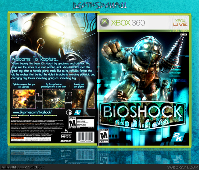
Great job on the back cover. I'd suggest tilting the big daddy in such a way that his left foot is also completely hidden by the bioshock logo. Right now, he looks as though he is levitating in mid-air over the cityscape.
I agree with Dmshaposv about the front cover by tilting the BD to the left so his foot isnt sticking out. Maybe move the dev logos and ESRB down a little bit cause the seem a lil high. And my last thing is that I personally dont like the entire BG behind the box. It could have looked better as a gradient.
 BioShock Box Cover Comments
Bioshock fever. inspiration from art book cover. cred to Crayon Man for the temp.
[ Reply ]
That's quite of good :) 4/5!
[ Reply ]
Very well made and professional. +fav
[ Reply ]
#2-3, thx guys
[ Reply ]
nice color choice and contrast! very nice!!
[ Reply ]
this is really good, nice job
[ Reply ]
sweeeeetness
[ Reply ]
#5-7, teh thankzness =P
[ Reply ]
I love it. One of the better Bioshock boxes. It's got a design that is different from the others and is presented really well. 5/5 + fav
[ Reply ]
very nice, I like this box. +fav
[ Reply ]
Great job on the back cover. I'd suggest tilting the big daddy in such a way that his left foot is also completely hidden by the bioshock logo. Right now, he looks as though he is levitating in mid-air over the cityscape.
[ Reply ]
I agree with Dmshaposv about the front cover by tilting the BD to the left so his foot isnt sticking out. Maybe move the dev logos and ESRB down a little bit cause the seem a lil high. And my last thing is that I personally dont like the entire BG behind the box. It could have looked better as a gradient.
[ Reply ]
Fantastic work, m8! +fav
[ Reply ]
This box is CONSTANTLY showing up in the "Random box" section and I have no idea why
[ Reply ]
I'm super cereal, dude, you need to re-work this.
[ Reply ]