Wow, i feel so honored! ^-^
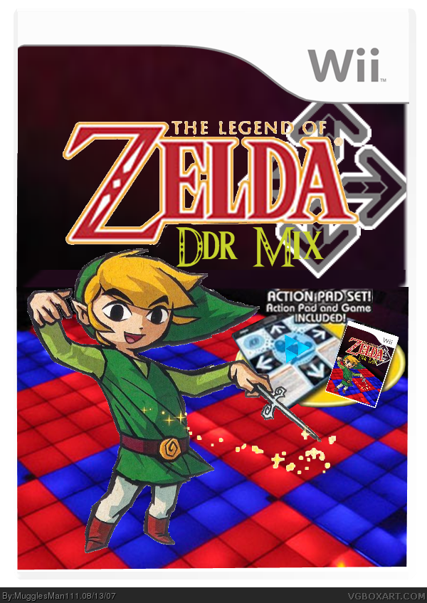
Anyway, it's pretty good. Though since Link is standing on a blue tile, you should alter the lighting on him to fit him in the environment. I Like the logo as well!
Here's how i would do it, Use the grindet tool in a new layer, then use the magic wand tool around the layer Link is in, click the layer the blue grindet is in and delete the selection. What you should have now is the grindet that is shaped like link. Tone down the either the fill or that other O word i can't remember to make it look a little invisible.
Oh, and use the color balance on the layer link is in and make him a little bluer. That should be enough.
I still think you should fix Link. He's not very well. Fix it and I might favorite it. And you should double, I mean TRIPLE post, sometimes it takes people time before they post.

 The Legend Of Zelda: DDR Mix Box Cover Comments
Lol
[ Reply ]
Made me laugh, but it's got a decent design as well.
[ Reply ]
#1/#2 lol thanks guys what score would you give it
i got this idea when i thought about how guitar hero mario mayhem made it into the hall of fame so i decided to make this
Edited at 1 decade ago
[ Reply ]
Edited at 1 decade ago
[ Reply ]
#4, MugglesMan111 please don't double post, edit your original comment.
[ Reply ]
Edited at 1 decade ago
[ Reply ]
#5 oh yea sorry
somethings messed up with my mouse it double clicks things
Edited at 1 decade ago
[ Reply ]
In full view it's not very well cut out. Link doesn't look very good. But I like the idea
[ Reply ]
i updated and added a dev logo and an esrb
[ Reply ]
comments?
[ Reply ]
#3,
Wow, i feel so honored! ^-^
Anyway, it's pretty good. Though since Link is standing on a blue tile, you should alter the lighting on him to fit him in the environment. I Like the logo as well!
[ Reply ]
#11 thanks would you like to favorite it lol. do you mean like put a glow around his feet like light is shining from the ground
[ Reply ]
Here's how i would do it, Use the grindet tool in a new layer, then use the magic wand tool around the layer Link is in, click the layer the blue grindet is in and delete the selection. What you should have now is the grindet that is shaped like link. Tone down the either the fill or that other O word i can't remember to make it look a little invisible.
Oh, and use the color balance on the layer link is in and make him a little bluer. That should be enough.
[ Reply ]
update. i could not figure out how to use the color balance so i just made the light from the floor shine on link
Edited at 1 decade ago
[ Reply ]
sorry i didn't find it funny, but it looks cool. made well for a satire. most people don't try on them.
[ Reply ]
#15 thanks and your right that alot of people dont try on them
Edited at 1 decade ago
[ Reply ]
comments? hehe
[ Reply ]
anyone there? :(
[ Reply ]
AWESOME! this deserve hall of fame
Edited at 1 decade ago
[ Reply ]
#19 thanks i wish it was hall of fame
[ Reply ]
oh i get it lol
[ Reply ]
I still think you should fix Link. He's not very well. Fix it and I might favorite it. And you should double, I mean TRIPLE post, sometimes it takes people time before they post.
[ Reply ]
LOL
[ Reply ]
Its coll idea but technicly he aint dancing
[ Reply ]