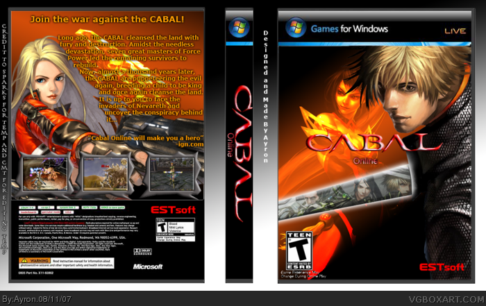
My Cabal online box.
did alot of editing here aswell, same as with my Kingdom hearts 2 box.
Hope you like it,
and for the people who can't read:
Credit to Sparks for Template and CMT for editing it into Games for windows temp ^^
Comments are appreciated.
If you made the spine and all, why didn't you make it 3d? The cover looks good and it looks like you're putting more thought into you're backs :]. 4.5/5
well, i didn't make the spine,x]. i got it from template section, and i like this layout.
and yeah, i really tried hard on this back, especially the text broke my effort for like an hour :P
thanks dude ^^
#6, Your not doing anything wrong at all, its a great box but people tend to either attack a box that isnt too good (like that mav wolf joke box) or if they dont know/like the game they wont comment. Its sad but true.
I really like this one. In my opinion it would've been better if you made the Cabal Online logo bigger. Also all the text on the background is sorta distracting.
Wow...this is probably one of your best so far, I love the design for both front and back. Template kicks ass too. The text under the esrb in the front isn't the best though, if you can't fix it then might as well get rid of it. esrb could be a bit bigger on the back as well, and I'd like to see a better back font but that's optional. I fav right now. keep up the good work
thanks #7-11, ghehe, 7-11.=.=
about the cabal logo, it was REALLY hard to find a proper sized one, and this was the biggest i could find.
I might delete the text under esrb, ad the Esrb on back was delivered with the template.x]
and the font seemed suitable for it..
i might search for something different though.
thanks everyone ^^
 Cabal Online Box Cover Comments
My Cabal online box.
did alot of editing here aswell, same as with my Kingdom hearts 2 box.
Hope you like it,
and for the people who can't read:
Credit to Sparks for Template and CMT for editing it into Games for windows temp ^^
Comments are appreciated.
[ Reply ]
If you made the spine and all, why didn't you make it 3d? The cover looks good and it looks like you're putting more thought into you're backs :]. 4.5/5
[ Reply ]
well, i didn't make the spine,x]. i got it from template section, and i like this layout.
and yeah, i really tried hard on this back, especially the text broke my effort for like an hour :P
thanks dude ^^
[ Reply ]
Really clean and nice 4.5/5 Great job! ^^
Edited at 1 decade ago
[ Reply ]
#4, seem to hear that alot.x]
thanks.
anything to improve?
[ Reply ]
wow, over 10-15 people online and i've got a super-thuper 2 comments =.='
plz, just tell me what i'm doing wrong?
[ Reply ]
Really nice job, Keep it up!
4.5/5
[ Reply ]
#6, Your not doing anything wrong at all, its a great box but people tend to either attack a box that isnt too good (like that mav wolf joke box) or if they dont know/like the game they wont comment. Its sad but true.
[ Reply ]
Great job, i like the colors.
[ Reply ]
I really like this one. In my opinion it would've been better if you made the Cabal Online logo bigger. Also all the text on the background is sorta distracting.
[ Reply ]
Wow...this is probably one of your best so far, I love the design for both front and back. Template kicks ass too. The text under the esrb in the front isn't the best though, if you can't fix it then might as well get rid of it. esrb could be a bit bigger on the back as well, and I'd like to see a better back font but that's optional. I fav right now. keep up the good work
[ Reply ]
thanks #7-11, ghehe, 7-11.=.=
about the cabal logo, it was REALLY hard to find a proper sized one, and this was the biggest i could find.
I might delete the text under esrb, ad the Esrb on back was delivered with the template.x]
and the font seemed suitable for it..
i might search for something different though.
thanks everyone ^^
[ Reply ]
Nice :-)
[ Reply ]