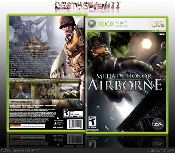
cred to Crayon Man for the temp, I know the front looks like Ricardo's box but oh well. I made some color adjustments to the guy on the front. about the text at the top, I got to color everything in personally =P and I never thought I'd find a use for that font lol. so please comment.
#12, haha, I've seen it to, just not off your box, I took the sypnosis off tothegame, and the header off your box =P (I didn't realize that you used the tothegame summary also)
but thx for the nice words :)
 Medal Of Honor: Airborne Box Cover Comments
Great box man.
[ Reply ]
I saw you post this in the forums and think it looked great!
[ Reply ]
cred to Crayon Man for the temp, I know the front looks like Ricardo's box but oh well. I made some color adjustments to the guy on the front. about the text at the top, I got to color everything in personally =P and I never thought I'd find a use for that font lol. so please comment.
[ Reply ]
#1-2, thx =)
[ Reply ]
#3, decapitatiom on dafont ;)?
nice box
+fav.
Edited at 1 decade ago
[ Reply ]
#5, yea lol. I had it laying around so I decided to have some fun with it =P
and thx for the fav.
[ Reply ]
I like the front except for the bottom left seems a lil empty.
[ Reply ]
#7, well there's not much I can do about that but thanks :)
[ Reply ]
this is tight
[ Reply ]
#9, thx dude
[ Reply ]
This is really good, well done.
[ Reply ]
I seen that synopsis before *AHEM!!*
But anyways the box is very nice, clean, crisp and simple.
4.5/5
[ Reply ]
#12, haha, I've seen it to, just not off your box, I took the sypnosis off tothegame, and the header off your box =P (I didn't realize that you used the tothegame summary also)
but thx for the nice words :)
[ Reply ]
#3, what do you mean "but oh well". you Change that RIGHT NOW!!!!!!!
lol
[ Reply ]