Great! But the style doesn't look that much of a Metal Gear Solid box. May I suggest altering the colors brown? Sorta like this. link If you did that, this would look pretty much great. Even better. I'm really good at making the back bottom templates. That's where all the copyright information is. Do you want me to provide you with one? I'll be more then happy too. Still, this box is pretty great. 4/5.
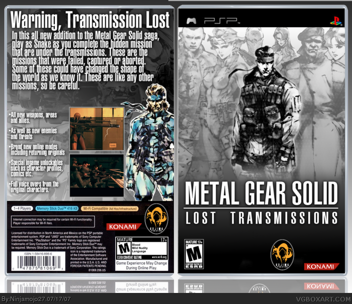
 Metal Gear Solid: Lost Transmissions Box Cover Comments
My comp box. View in full or look at in small. Just bigger in full. Fav if you like it.
[ Reply ]
Great! But the style doesn't look that much of a Metal Gear Solid box. May I suggest altering the colors brown? Sorta like this. link If you did that, this would look pretty much great. Even better. I'm really good at making the back bottom templates. That's where all the copyright information is. Do you want me to provide you with one? I'll be more then happy too. Still, this box is pretty great. 4/5.
[ Reply ]
Oops! I forgot to mention one thing. There is a gray line in the right side above the front cover. Try fixing that also.
[ Reply ]
I guess your right. I dont think I will update it cause I like the way it is. As for the line. I have know odea what it is.
[ Reply ]
Great work Ninja. I'd suggest decreasing the size of the text on the synopsis. :)
[ Reply ]
It doesnt look that good small. Plus there would be a lot of empty space.
[ Reply ]
Ya, this pwns. I think the text for the slogan on the back may have looked better as a computer module font. But still, very nice.
[ Reply ]
Thank you Michael.
[ Reply ]
Wow, 8 comments and it gets knocked off the comment section...
[ Reply ]
I don't mind the lack of colors, I think it's quite stylish actually. :)
[ Reply ]
#10, Thank you.
[ Reply ]
yeah i like this one and i agree with #5 about text
[ Reply ]
Sweet box, but on the back it says "These are like any other missions" I think you meant to put "These aren't like any other missions"
[ Reply ]