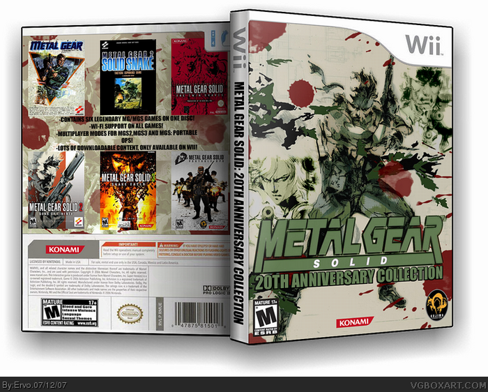
My first box with Imandix. Text on the back was hard to think so that's why it sounds stupid :D I think it looks ptretty nice. Comments and faves are appreciated :)
The front is a bit cluttered - I can hadly see the logo. Also the games on the back should have the temps cut of them, e.g. you would never see a Wii game with a PS2 game cover on it. 3/5
#6 I love this box, and yes that might be a good idea since it will stand out more. The front is amazing by itself, but the overlapping images in the back could be better. great job overall.
 Metal Gear Solid Collection Box Cover Comments
My first box with Imandix. Text on the back was hard to think so that's why it sounds stupid :D I think it looks ptretty nice. Comments and faves are appreciated :)
[ Reply ]
The front is a bit cluttered - I can hadly see the logo. Also the games on the back should have the temps cut of them, e.g. you would never see a Wii game with a PS2 game cover on it. 3/5
[ Reply ]
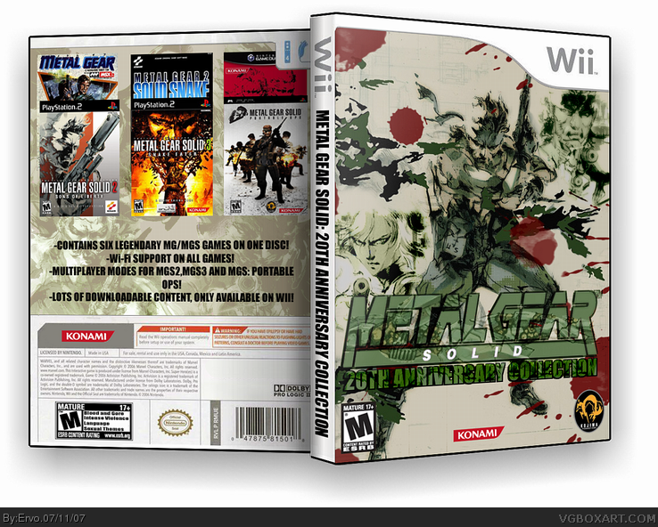
#2, Fixed. Is it better now?
[ Reply ]
#3, Yeah, but the logo is still a bit lost. 3.5/5
[ Reply ]
looks cool
[ Reply ]
#4, What should i do with the logo then? Remove the Metal Gear Ray?
[ Reply ]
#6 I love this box, and yes that might be a good idea since it will stand out more. The front is amazing by itself, but the overlapping images in the back could be better. great job overall.
[ Reply ]
UPDATED! I changed the look of the back a little bit and removed Metal Gear Ray from the logo.
[ Reply ]
wow, much cleaner and looks more official. Naturally tnx for taking our advice and this deserves more favs.
Edited at 1 decade ago
[ Reply ]
#9, thanks to you for helping me :) and you faved it, thanks!
[ Reply ]