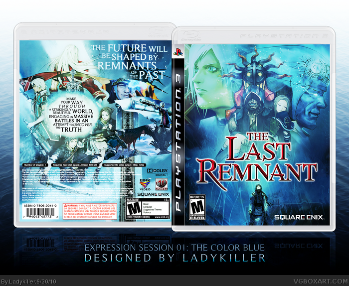
woah, this is hot. the game looks super awesome.
the test looks weird on the back, and the canvas background shouldnt be so much... its a bit distracting. if you still want that image you might want to lower the opacity. one more thing, the square enix logo on the front might as well be white.
overall, well done.
#1 thanks, my first ps3 boxart of a game I'm very excite for. Not much material since it's not out yet, though I still think it turned out nice. haha I kinda like the background like that since it corresponds to the back, but you're right about the squenix logo...minor but I'll try to fix. As always comments and suggestions are welcome, enjoy!
Wow i think this is a really good box art. The only thing i think i have to say about it is that the entire backdrop behind the boxart is a huge contrast...it hurts my eyes... i think if it was darker it would go better! 4.5/5
thanks #3! haha...and the background is like that, because of the lighting efx, I'll tone it down next time but I still think it makes the box look better.
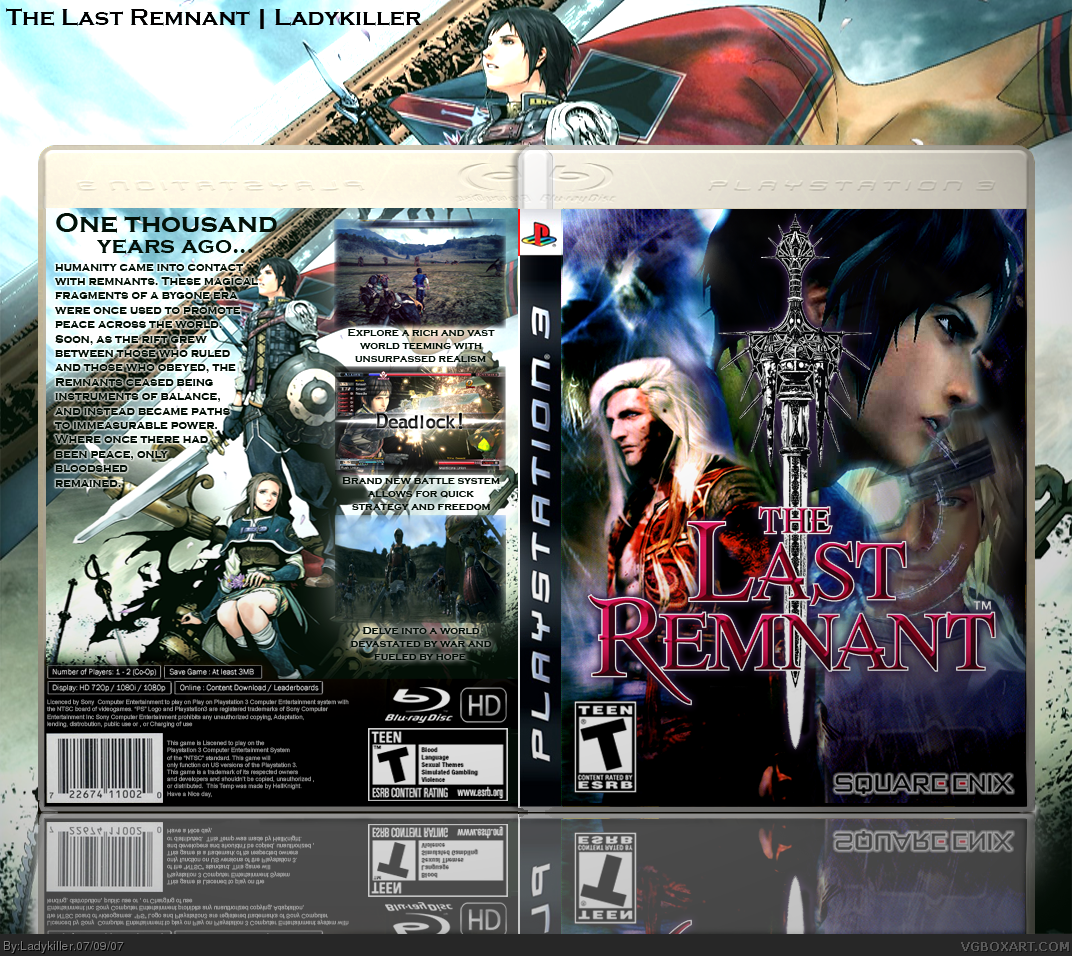
Update! (Also probably the last of my current boxes that needed updating) Took all the advice stated previously, added a better and more beautiful bg also. So much better than v1 imo. tell me what you think
It has been over 2 years now since I last made a new box design and almost 3 years since the first version of this box was made.
Hopefully, I haven't gotten rusty. ;)
This is essentially a new design for an old box. Not sure if I would call it just an "update" given how drastic the changes were - I suppose I could have easily posted this as a new box, but whatever. I do encourage you guys to click the previous versions to check, however.
This was made for the first Expression Session and being a 2 year comeback box, lots of time and effort was put into this. I really wanted to incorporate the "Color Blue" theme in all aspects including the presentation to give it an almost ethereal feel to it and I'm very satisfied in this regard.
A few more things about the box: it took awhile to really get the front and back compositions down to how I want them, but I'm happy with the final result. Decided to keep the old PS3 template due to more vertical space. Some vector work is also present in the screenshot shapes. Some of you might even spot a certain design reference on the back.
Credits go to Sens for the template and Scorpion Soldier for providing editable back info text and font. Thanks guys.
As always, comments are welcome and appreciated. Cheers!
Well isn't this session bringing some of the most amazing boxes to the site? Really incredible job here LK, the use of blue really makes this box shine, and the other colors balance it out very well. The composition is just great, and the text effects on the back are very nice.
Totally forgot to mention this, but the back composition was definitely something I experimented with quite a bit. Looking back at it (as I discussed with Beer) it looks like the back design will be a love/hate thing. Personally, I wanted to try something new and ended up loving how well the design flows once I finished it. Lots of work with lighting in this one as well.
@qwerty: I somehow knew you'd be able to spot it. xD
JK, this is absolutely FANTASTIC. Everything from the front composition to the back typography is absolutely pitch-perfect, it's amazing to see how far you've come as an artist.
EDIT: I'm guessing the "reference" is the SotC-style synopsis?
"...it's amazing to see how far you've come as an artist." "As artist" may be true, but there's still something missing for a boxartist. Why? Becase the whole copy is unreadable. Why do people put white text on bright backgrounds?
Yep, the reference was the SotC style synopsis. ;)
I can read it just fine as well... wasa-bi was probably referring to the back legal text, which I actually tried making black once, but it looked really ugly (not to mention out of place with the blue/white color scheme) so I stuck with the white font color. Purely aesthetic reason I suppose.
And thanks again, guys. #26, I'm definitely thinking about it. :D
#27, It may be aesthetic, but that part is very important, since it got (c) and other legal stuff. It should be readable at all time. and if it looks ugly, come up with something to make it look good.
#28, Like I said, I've tried different ways to make it stand out: make the font color black or make that background part a bit darker - both looked ugly to me.
I simply chose not to compromise the design. I'm aware of its "importance" and if I was designing this as a real printable cover design (hi-res and all that), believe me I would definitely have done something about it.
What I think you're missing at here is the fact that this was designed with the recent Expression Session in mind. It's a movement that encourages and focuses on creativity unbounded by arbitrary boxart "rules" like "this should always be readable" or "this must always have these logos blah blah blah" and rightly so since this is a hobby site first and foremost. Atleast, that's how I see it.
Heck, at one point... I was thinking of just doing away with all the legal text and logos to have an even more focused design.
#29, sure, it is just a hobby... but that's a weak argument, since it is about "boxarts". so the argument about "how a real box is supposed to be" is a quite legitimate one. that's why I said ""As artist" may be true, but there's still something missing for a boxartist.", meaning it is looking good, but just not working as boxart. it seems you are ignoring this. it's the art behind "boxart" to make it look good with all the ugly parts of a template. if you just change them, you are "cheating" in some way. yes, I do know the aesthetic reasons, I have to handle that all day, but that's not how it is supposed to work.
anyways, this page is about boxarts, so I do judge them as boxart, and as "simple" art alone.
#31, I said this was a "hobby site first and foremost" not "JUST a hobby" so stop acting like that's the argument I have. There's a difference.
I don't have any qualms with you looking at it as a retail boxart nor am I ignoring anything - my comment was made to tell you that the EMPHASIS of this boxart (and the Expression movement as well) is more about creativity and not so much about making it look like retail. The "how a box is supposed to be" mentality was not really the focus for me - the intentionally missing elements like screenshot descriptions I usually put on my boxes are evident enough of this.
Ofcourse, you're welcome to judge it as both "boxart" and "simple art" alone as you said, but I was just telling you that the latter had a lot more emphasis than the former during the creation process.
I fail to see how it's "just not working as boxart" because of a detail like that anyway, but that's your opinion I suppose. If you actually read my comments, I've both recognized the crit and explained as to why I made it like that so I'm not really sure why you're still going on about this.
You sure can be creative without changing anything on a template, to make it look like a real boxart. choosing one doesn't prevent you from choosing the other too. If you actually read my comments you've recognized you get kudos for the look, but critique for the boxart as... well, boxart - and maybe also that I do accept your "aesthetic" argument. No reason to drama… AGAIN!
Besides: That's not MY opinion, that's a fact. You just can't publish anything with almost invisible legal stuff, since that is important.
Yeah, I agree with that. However, I never said that choosing one prevented me from having the other as well. Just stated that I put a lot more emphasis on one of them.
For example, yes.. I did try to make it look retail and to an extent it does look like retail, but my focus was obviously more on the creative or aesthetic aspect (evident from previously said missing elements, unusual back layout, and aesthetic decisions like the legal text color)
Yeah, I'm aware of the fact that it has to be readable if publish/printed and like I previously mentioned, if I was designing this to look exactly like a retail box with a printable, I would definitely compromise to make it more readable (even though it might still look ugly to me)
And yes, I'm aware and appreciate the kudos. I did explain the rationale about that critique and thanks for taking the time to give it. No drama here lol
you just have to accept the fact that a lot of the stuff you have to put into official works will look ugly to you. but you just cannot change given ci/cds, unless they are your own.
Yep, I know that. I don't recall ever denying that fact though... nor am I passing this off as official or anything lol (or official enough for someone to print it). Heck, this game isn't even for PS3 since it got cancelled. There's a reason why the boxarts we design on this site are under "Unofficial" after all.
 The Last Remnant Box Cover Comments
woah, this is hot. the game looks super awesome.
the test looks weird on the back, and the canvas background shouldnt be so much... its a bit distracting. if you still want that image you might want to lower the opacity. one more thing, the square enix logo on the front might as well be white.
overall, well done.
[ Reply ]
#1 thanks, my first ps3 boxart of a game I'm very excite for. Not much material since it's not out yet, though I still think it turned out nice. haha I kinda like the background like that since it corresponds to the back, but you're right about the squenix logo...minor but I'll try to fix. As always comments and suggestions are welcome, enjoy!
[ Reply ]
Wow i think this is a really good box art. The only thing i think i have to say about it is that the entire backdrop behind the boxart is a huge contrast...it hurts my eyes... i think if it was darker it would go better! 4.5/5
[ Reply ]
thanks #3! haha...and the background is like that, because of the lighting efx, I'll tone it down next time but I still think it makes the box look better.
[ Reply ]
very great job ! fav.
[ Reply ]
This is a job well done ! 5/5!
[ Reply ]
Update! (Also probably the last of my current boxes that needed updating) Took all the advice stated previously, added a better and more beautiful bg also. So much better than v1 imo. tell me what you think
Edited at 1 decade ago
[ Reply ]
sorry to bump but i gotta say this rocks.
[ Reply ]
I havent seen this!?
Awesome!!
+fav
[ Reply ]
HoF! congrats lk
[ Reply ]
i dont think i ever saw this LK, looks great +fav!
[ Reply ]
Amazing, really good
[ Reply ]
This update is most impressive.
[ Reply ]
The update looks much better. Great job
[ Reply ]
It has been over 2 years now since I last made a new box design and almost 3 years since the first version of this box was made.
Hopefully, I haven't gotten rusty. ;)
This is essentially a new design for an old box. Not sure if I would call it just an "update" given how drastic the changes were - I suppose I could have easily posted this as a new box, but whatever. I do encourage you guys to click the previous versions to check, however.
This was made for the first Expression Session and being a 2 year comeback box, lots of time and effort was put into this. I really wanted to incorporate the "Color Blue" theme in all aspects including the presentation to give it an almost ethereal feel to it and I'm very satisfied in this regard.
A few more things about the box: it took awhile to really get the front and back compositions down to how I want them, but I'm happy with the final result. Decided to keep the old PS3 template due to more vertical space. Some vector work is also present in the screenshot shapes. Some of you might even spot a certain design reference on the back.
Credits go to Sens for the template and Scorpion Soldier for providing editable back info text and font. Thanks guys.
As always, comments are welcome and appreciated. Cheers!
[ Reply ]
Well isn't this session bringing some of the most amazing boxes to the site? Really incredible job here LK, the use of blue really makes this box shine, and the other colors balance it out very well. The composition is just great, and the text effects on the back are very nice.
[ Reply ]
OH
MY
GOD
[ Reply ]
^ That times googleplex.
Astounding front & back compositions, Al. I haven't seen such a well thought-out box in a long time! I like the little SotC reference also, lol.
Edited at 1 decade ago
[ Reply ]
My dick just erected
[ Reply ]
This is blue on a mission man. Outstanding update!
[ Reply ]
Thanks guys. :)
Totally forgot to mention this, but the back composition was definitely something I experimented with quite a bit. Looking back at it (as I discussed with Beer) it looks like the back design will be a love/hate thing. Personally, I wanted to try something new and ended up loving how well the design flows once I finished it. Lots of work with lighting in this one as well.
@qwerty: I somehow knew you'd be able to spot it. xD
[ Reply ]
Anyway, about the cover, I don't have much it say. All that I can say is that its pretty amazing.
Okay no one else had to read what I previously wrote here. #23 I feel pretty stupid now.
Edited at 1 decade ago
[ Reply ]
#22, Hehe, this is an updated case. It was posted originally almost 3 years ago.
[ Reply ]
You've gotten sloppy, old man.
JK, this is absolutely FANTASTIC. Everything from the front composition to the back typography is absolutely pitch-perfect, it's amazing to see how far you've come as an artist.
EDIT: I'm guessing the "reference" is the SotC-style synopsis?
Edited at 1 decade ago
[ Reply ]
"...it's amazing to see how far you've come as an artist." "As artist" may be true, but there's still something missing for a boxartist. Why? Becase the whole copy is unreadable. Why do people put white text on bright backgrounds?
Edited at 1 decade ago
[ Reply ]
#25, I can read it fine.
Anyway, the box looks really great LK. Does this mean you'll be making boxes for the future sessions?
[ Reply ]
Yep, the reference was the SotC style synopsis. ;)
I can read it just fine as well... wasa-bi was probably referring to the back legal text, which I actually tried making black once, but it looked really ugly (not to mention out of place with the blue/white color scheme) so I stuck with the white font color. Purely aesthetic reason I suppose.
And thanks again, guys. #26, I'm definitely thinking about it. :D
[ Reply ]
#27, It may be aesthetic, but that part is very important, since it got (c) and other legal stuff. It should be readable at all time. and if it looks ugly, come up with something to make it look good.
[ Reply ]
#28, Like I said, I've tried different ways to make it stand out: make the font color black or make that background part a bit darker - both looked ugly to me.
I simply chose not to compromise the design. I'm aware of its "importance" and if I was designing this as a real printable cover design (hi-res and all that), believe me I would definitely have done something about it.
What I think you're missing at here is the fact that this was designed with the recent Expression Session in mind. It's a movement that encourages and focuses on creativity unbounded by arbitrary boxart "rules" like "this should always be readable" or "this must always have these logos blah blah blah" and rightly so since this is a hobby site first and foremost. Atleast, that's how I see it.
Heck, at one point... I was thinking of just doing away with all the legal text and logos to have an even more focused design.
[ Reply ]
zomg killer of ladies.
I love how this box got so many favs just because you did it LK XD
But that's not to say it isn't awesome.
[ Reply ]
#29, sure, it is just a hobby... but that's a weak argument, since it is about "boxarts". so the argument about "how a real box is supposed to be" is a quite legitimate one. that's why I said ""As artist" may be true, but there's still something missing for a boxartist.", meaning it is looking good, but just not working as boxart. it seems you are ignoring this. it's the art behind "boxart" to make it look good with all the ugly parts of a template. if you just change them, you are "cheating" in some way. yes, I do know the aesthetic reasons, I have to handle that all day, but that's not how it is supposed to work.
anyways, this page is about boxarts, so I do judge them as boxart, and as "simple" art alone.
Edited at 1 decade ago
[ Reply ]
#31, I said this was a "hobby site first and foremost" not "JUST a hobby" so stop acting like that's the argument I have. There's a difference.
I don't have any qualms with you looking at it as a retail boxart nor am I ignoring anything - my comment was made to tell you that the EMPHASIS of this boxart (and the Expression movement as well) is more about creativity and not so much about making it look like retail. The "how a box is supposed to be" mentality was not really the focus for me - the intentionally missing elements like screenshot descriptions I usually put on my boxes are evident enough of this.
Ofcourse, you're welcome to judge it as both "boxart" and "simple art" alone as you said, but I was just telling you that the latter had a lot more emphasis than the former during the creation process.
I fail to see how it's "just not working as boxart" because of a detail like that anyway, but that's your opinion I suppose. If you actually read my comments, I've both recognized the crit and explained as to why I made it like that so I'm not really sure why you're still going on about this.
[ Reply ]
I like you too~
You sure can be creative without changing anything on a template, to make it look like a real boxart. choosing one doesn't prevent you from choosing the other too. If you actually read my comments you've recognized you get kudos for the look, but critique for the boxart as... well, boxart - and maybe also that I do accept your "aesthetic" argument. No reason to drama… AGAIN!
Besides: That's not MY opinion, that's a fact. You just can't publish anything with almost invisible legal stuff, since that is important.
Greez from Goemon btw. º∆º
Edited at 1 decade ago
[ Reply ]
#33, hahaha xD
Yeah, I agree with that. However, I never said that choosing one prevented me from having the other as well. Just stated that I put a lot more emphasis on one of them.
For example, yes.. I did try to make it look retail and to an extent it does look like retail, but my focus was obviously more on the creative or aesthetic aspect (evident from previously said missing elements, unusual back layout, and aesthetic decisions like the legal text color)
Yeah, I'm aware of the fact that it has to be readable if publish/printed and like I previously mentioned, if I was designing this to look exactly like a retail box with a printable, I would definitely compromise to make it more readable (even though it might still look ugly to me)
And yes, I'm aware and appreciate the kudos. I did explain the rationale about that critique and thanks for taking the time to give it. No drama here lol
[ Reply ]
you just have to accept the fact that a lot of the stuff you have to put into official works will look ugly to you. but you just cannot change given ci/cds, unless they are your own.
anyways, this has gone already a bit too far.
[ Reply ]
Yep, I know that. I don't recall ever denying that fact though... nor am I passing this off as official or anything lol (or official enough for someone to print it). Heck, this game isn't even for PS3 since it got cancelled. There's a reason why the boxarts we design on this site are under "Unofficial" after all.
EDIT: Regards to Goemon as well.
Edited at 1 decade ago
[ Reply ]
Damn..I love the way you re-worked the box.
[ Reply ]
LK have my children please.
[ Reply ]
Lovely.
[ Reply ]