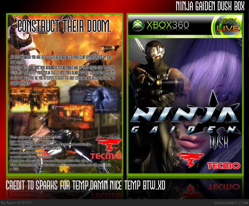
My ninja Gaiden:Dusk box.
it's a sort-of-remake of NG:black with online features and extra features,
online= co-operating and fighting your way through dungeons.
hope you like:D!
ah who cares?XD i personally think DEV logo's are fine. sorry.
also, the 1 player etc.,, i might update that once... thanks :D
but to be honest, doesn't it deserve more than a 4/5? it's dissapointing for me anyhow.
thanks anyways.XD
-edit- what do you guys think about my custom logoXD?
Not bad at all. I like the name, the logo doesn't look bad, but the "Dusk" is a little hard to read. The back is pretty good, it feels crowded though.
And your system info paragraph reminds me of something......... ;)

 Ninja Gaiden: Dusk Box Cover Comments
My ninja Gaiden:Dusk box.
it's a sort-of-remake of NG:black with online features and extra features,
online= co-operating and fighting your way through dungeons.
hope you like:D!
[ Reply ]
10/10 Mindblowing
(In about 4 weeks ill start making boxes again too ^^ Ya improved allot!)
[ Reply ]
The front needs a rating. The game is rated mature. It's good. But I think the copyright information kills it. Lol. 4/5.
[ Reply ]
whee not cool =[ only because of copyright info, you give it 1/5 lower? =[.XD
i forgot rating, im going to rate now.
-edit- added rating.
Edited at 1 decade ago
[ Reply ]
#4, jk. It don't kill it! I don't wanna be pimped slapped by a fish! :(
Or better yet... BITCH SLAPPED.
[ Reply ]
Looks nice But there are a few problems.
* You forgot the details on the back (1 player, analog control etc).
* The dev logos are to big.
Other then that it nice 4/5 .
[ Reply ]
ah who cares?XD i personally think DEV logo's are fine. sorry.
also, the 1 player etc.,, i might update that once... thanks :D
but to be honest, doesn't it deserve more than a 4/5? it's dissapointing for me anyhow.
thanks anyways.XD
-edit- what do you guys think about my custom logoXD?
Edited at 1 decade ago
[ Reply ]
#7, I like it the logo. Can you post in the Box material, simple needs Thread ?
[ Reply ]
i might, i think i've only saved as .psd for the reflection though, so it might take some time,;)
[ Reply ]
Thia REALLY cought my attention on the front page 5/5. +fav
[ Reply ]
i take that as a big compliment, i'm just praying this one doesn't get under-commented!
[ Reply ]
Not bad at all. I like the name, the logo doesn't look bad, but the "Dusk" is a little hard to read. The back is pretty good, it feels crowded though.
And your system info paragraph reminds me of something......... ;)
[ Reply ]
rofl yeah. true #12, and thanks, i guess.XD
i tried to make dusk more, well, visible, but that didn't work.
[ Reply ]
UPDATE! added more back info! :D
[ Reply ]