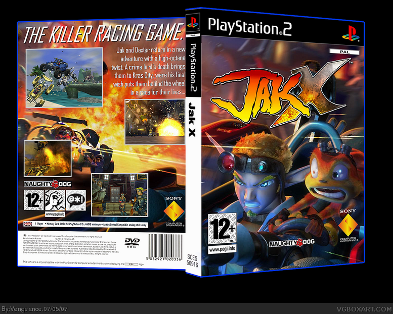
The Front is pretty good, except move the dev logo's down more. The back looks uncompleted to me, but at least it's not empty. :P
3/5 until you fix the front and back.
#2, jeez, 3/5? did you look at the WIP thread, i said why the dev logos are so high. i couldn't put anything else onto the back, because there wasn't the right space and it would ruin it if i added more text. but hey, i suck...
#3, Hey, I'm trying to help out. Just move the dev. down and make the screenshots on the back, more organize. It would help this box, alot. The front is great btw, it's just the placement of the dev that ruins it as their shouldn't be that much space under it. Also 3/5 doesn't mean it sucks, it's means it's ok/good.
Also I didn't see that thread, you should have waited until someone responded.
#5 well you can still update it with my advise. sorry about not responding on the thread...but you have to know I'm not on this site all the time and wasn't there to give my input to your box before you summited it....
#11, That doesn't mean you have to use it. It's not like they have a blue outline. Changing it to black or something would look better, and thus the box would be better.
yeah, they do #14. i live in europe =.='Pal boxes have plain white spines as well, which is nice for us, because game stores can but them with the spine out of the shelves, and have more free space xD!
I think it's nice and I agree with what PunisherAB said. Also I reckon you made the PEGI, Naughty Dog, and the SCEA logos way too high. This actually applies to a couple of your recent boxes.
#19, well you're going to have to live with the fact that i want my boxes to look similar to a real thing, so there's no way i'm changing the spine unless i actually make an NSTC box.
 Jak X Box Cover Comments
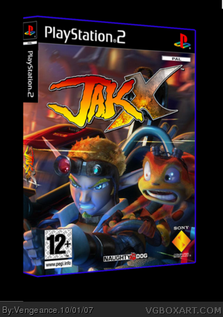
here's my Jak X box, thx to all who commented in the forums, please leave a comment here KTHNX
[ Reply ]
The Front is pretty good, except move the dev logo's down more. The back looks uncompleted to me, but at least it's not empty. :P
3/5 until you fix the front and back.
[ Reply ]
#2, jeez, 3/5? did you look at the WIP thread, i said why the dev logos are so high. i couldn't put anything else onto the back, because there wasn't the right space and it would ruin it if i added more text. but hey, i suck...
[ Reply ]
#3, Hey, I'm trying to help out. Just move the dev. down and make the screenshots on the back, more organize. It would help this box, alot. The front is great btw, it's just the placement of the dev that ruins it as their shouldn't be that much space under it. Also 3/5 doesn't mean it sucks, it's means it's ok/good.
Also I didn't see that thread, you should have waited until someone responded.
Edited at 1 decade ago
[ Reply ]
ohh i wish i deleted this now.
#4, um, about that thread, yeah, i got about 10 responses.
Edited at 1 decade ago
[ Reply ]
#5 well you can still update it with my advise. sorry about not responding on the thread...but you have to know I'm not on this site all the time and wasn't there to give my input to your box before you summited it....
[ Reply ]
I would've liked it if you posted the sly copper one....but oh well this is quite good. The back,as I said before, could have been more spiced up. :)
[ Reply ]
this box is good i like the design but as PunisherAB said it does have its flaws but its still nice. 4/5
[ Reply ]
I agree with PunisherAB but it's still nice 4/5
[ Reply ]
I think spine ruins everything. It's so white ;)
[ Reply ]
Mad Spike, thats what PAL boxes are like with plain spines...
The box itslef isn't too bad, could have done a little better.
[ Reply ]
#11, That doesn't mean you have to use it. It's not like they have a blue outline. Changing it to black or something would look better, and thus the box would be better.
Edited at 1 decade ago
[ Reply ]
#2, i agree
[ Reply ]
#12, excuse me, but PAL boxes DO have a blue outline and a white spine. I want to keep my boxes as official-looking as possible, thank you.
[ Reply ]
love it. looks great.
[ Reply ]
yeah, they do #14. i live in europe =.='Pal boxes have plain white spines as well, which is nice for us, because game stores can but them with the spine out of the shelves, and have more free space xD!
[ Reply ]
Only the really old PS2 games have black cases.. For Europe
[ Reply ]
I think it's nice and I agree with what PunisherAB said. Also I reckon you made the PEGI, Naughty Dog, and the SCEA logos way too high. This actually applies to a couple of your recent boxes.
Edited at 1 decade ago
[ Reply ]
#11, I know. We have white spine in our shops too, but it doesn't looks good.
[ Reply ]
#19, well you're going to have to live with the fact that i want my boxes to look similar to a real thing, so there's no way i'm changing the spine unless i actually make an NSTC box.
[ Reply ]
Nice box, dude. A+.
[ Reply ]
Update, i decided to get rid of the back and change some stuff. I think it looks better now.
[ Reply ]
I fave.
[ Reply ]
awesome box 5/5
[ Reply ]