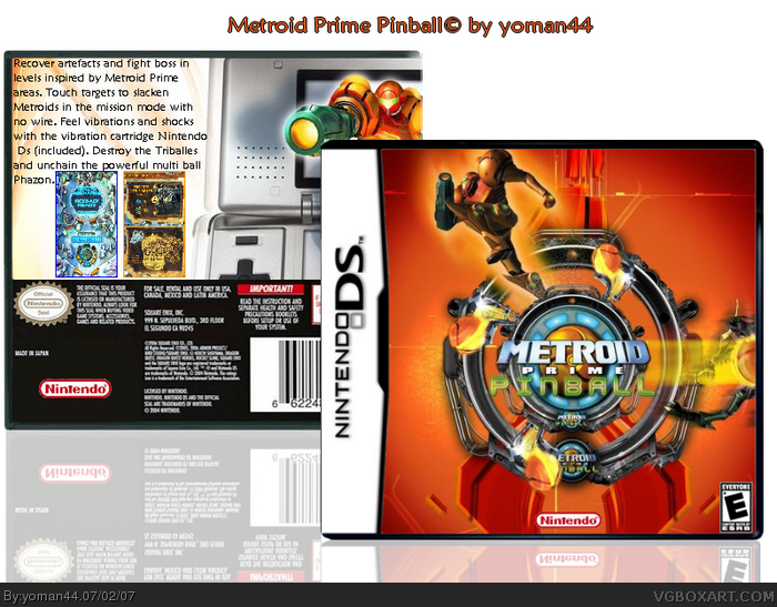
Improvement, well i don't think the logo should be there 3 times, just the one in the center is good, on the back make the text smaller and make it look more iteresting, maybe change the tex to white and add a black stroke around, and be able to fit i'd say 1 more screen shot in, the screens are a little to close to the text, and finaly, get rid of that nintendo logo on the back, that's were esrb logo info goes or just leave a black spot, but this is still a good box i like the style of it 4/5
 Metroid Prime Pinball Box Cover Comments
I hope you like it.
[ Reply ]
i like the front a lot.
[ Reply ]
whoa
[ Reply ]
#3, #2, Thanks guys ^^
[ Reply ]
front is very nice but the text on back is kinda choppy...
nice job mate 4/5
[ Reply ]
the front is impressive, but the esrb is too small, or at least shouldnt be touching the template.
[ Reply ]
Improvement, well i don't think the logo should be there 3 times, just the one in the center is good, on the back make the text smaller and make it look more iteresting, maybe change the tex to white and add a black stroke around, and be able to fit i'd say 1 more screen shot in, the screens are a little to close to the text, and finaly, get rid of that nintendo logo on the back, that's were esrb logo info goes or just leave a black spot, but this is still a good box i like the style of it 4/5
[ Reply ]
this game hasn't even came out in europe yet... :/
[ Reply ]
#6, I think the esrb logo doesn't touch the temp. (look in the reflection.)
[ Reply ]
#8, Wow really ? The game came out in 2005 in the USA .
[ Reply ]
#10, i know, that really sucks. i think it's coming 27th july for us... is it any good?
[ Reply ]
lew u speel guud.
[ Reply ]