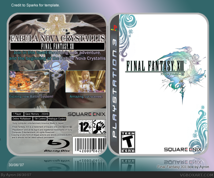
I think the front is decent, but the back isn't. I think on the back you should have more information, screen shots, and try and make sure the girl's face isn't covered-up, and have a better consistency of colors, because green/pink text doesn't work.
 Final Fantasy XIII Box Cover Comments
My FF13 box, took me a whole while to finish, so comments are appreciated as always. ;)
[ Reply ]
nice front, i like it but the back needs more words.
[ Reply ]
!!!!!!!!!!!!!!!! ( means 5.1/5)
[ Reply ]
lolz thanks guys, the back needs more words, ok. but it's hard to think of any for a game not yet released, also, the space was very limited.;)
[ Reply ]
i really like the graphics on the top right and bottom left...4/5, only because the back could be better
Edited at 1 decade ago
[ Reply ]
I think the front is decent, but the back isn't. I think on the back you should have more information, screen shots, and try and make sure the girl's face isn't covered-up, and have a better consistency of colors, because green/pink text doesn't work.
[ Reply ]
it's green/purple, and i did it because those are the colours in the logo, my 'sort of colour scheme';)
thanks anyways.
[ Reply ]
2 words: Awesome job.
[ Reply ]
thank you, i wasn't expecting another comment though.xD
[ Reply ]