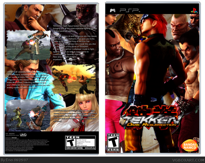
Another Tekken DR box from me. I dont know which i like better, this or the another one. But this one has better back :) I hope this one wont make you angry :D Remember to fave if you like it :P
Ooo! Nice one! Only prob is the text is a bit weird at the back. Also it's kind of bland, but you know, I think the blandness makes it look better somehow. Good job, 4/5! ;)
it does look nice, but u didnt cut the logo out all the way and the game logo doesnt go on the back of boxes.also the logo on the front should be moved up and centered, also you should do something with the background of the box in stead of leaving it white. nice and better then before though.
 Tekken Dark Resurrection Box Cover Comments
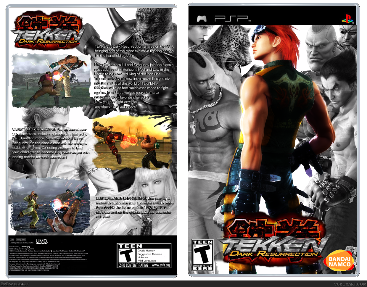
Another Tekken DR box from me. I dont know which i like better, this or the another one. But this one has better back :) I hope this one wont make you angry :D Remember to fave if you like it :P
Edited at 1 decade ago
[ Reply ]
aweeeeeesome
[ Reply ]
Ooo! Nice one! Only prob is the text is a bit weird at the back. Also it's kind of bland, but you know, I think the blandness makes it look better somehow. Good job, 4/5! ;)
[ Reply ]
it does look nice, but u didnt cut the logo out all the way and the game logo doesnt go on the back of boxes.also the logo on the front should be moved up and centered, also you should do something with the background of the box in stead of leaving it white. nice and better then before though.
[ Reply ]
it's nice.. but it's in the same style as your last one, which i really find effortless..3.5/5
[ Reply ]
I made what Shadysaiyan told me to and now it looks MUCH better. Thanks dude :)
[ Reply ]
Veyr good! 4.5/5. It could maybe use a slogan at the top, like Welocme to the king of iron fist tournement or something on the back.
Edited at 1 decade ago
[ Reply ]