 Tom Clancy's Splinter Cell: Pandora Tomorrow Box Cover Comments
Comment on Destroyer's Tom Clancy's Splinter Cell: Pandora Tomorrow Box Art / Cover.
Comment on Destroyer's Tom Clancy's Splinter Cell: Pandora Tomorrow Box Art / Cover.
This is my first box please comments !
[ Reply ]
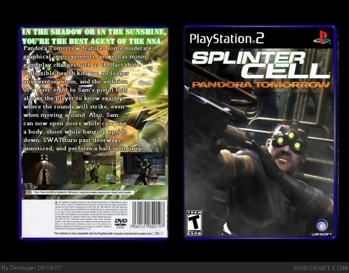
Very good for a first one, but here are some improvement suggestions that I must say. NTSC logo should be added. Also the ESRB and Ubisoft logos are too small and too near the edges. I personally wouldn't place the game logo so near the top. And the game description isn't very good. It sounds more like a short review of the gameplay than a promo text that it should be. Also the bottom part of the backcover is notably smudgy.
[ Reply ]
good first though i see a line on the right get rid if it and the esrb logo seems blurry but its a good start, welcome to the site 4/5
and what program do you use?
[ Reply ]
To me, it seems the game's description is covering too much of the artwork, I think it's a good idea giving space for things to breathe. Also things seem stretched, I recommend trying to keep things in proportion. Not too bad though for a first box.
[ Reply ]
that's good for a first
[ Reply ]