[ Box updated on June 14th, 2007 ] [ original ]
 The Legend of Zelda: Twilight Princess Box Cover Comments
Comment on Roboross's The Legend of Zelda: Twilight Princess Box Art / Cover.
[ Box updated on June 14th, 2007 ] [ original ]
Comment on Roboross's The Legend of Zelda: Twilight Princess Box Art / Cover.
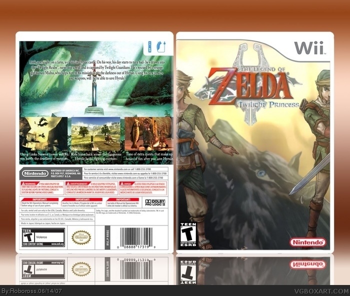
I wanted to do my own Legend of Zelda: Twilight Princess after i saw that all the one's already made all pretty much had the same pictures, no offense. They were still good but i wanted to try to make mine a little different. I guess tell me what you think:D
And what i should do better next time?
Edited at 1 decade ago
[ Reply ]
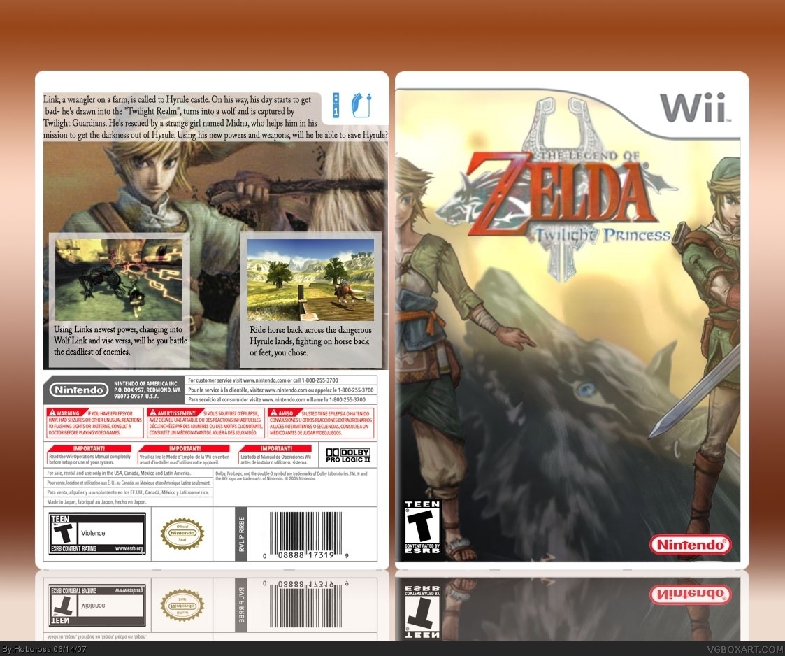
I Like the front, not the back so much. It is very boring, and the text is not very good. A well made box in the proccess, though.
[ Reply ]
#2, how should i change the back? Like im kinda new at this haha.
[ Reply ]
i like it, i don't like the picture of link the one on the right maybe reverse it back the way its was
[ Reply ]
#3, Sorry, I forgot about that. :) Anyway, you really should get rid of that white thing behind the text, because it looks very tacky. Add a few more screens to the back, or you can rearange the screens with bigger descriptions, other than that, it is perfectly fine! :)
[ Reply ]
try next time to make the reflection fade away
[ Reply ]
#6, How do you do that?
[ Reply ]
Alright i re-did the back.
Any better?
[ Reply ]
Very nice!
[ Reply ]
#9, Thanks. :DD
Edited at 1 decade ago
[ Reply ]
I agree, the back is much better now. One suggestion: change the text ON the screenshots to white, and move them down below the screenshots. That would look a lot better, and less crowded, in my opinion.
But all in all a nice box. :D
[ Reply ]
#11, Alright.. like that?
[ Reply ]
good job!
[ Reply ]