[ Buy Red Dead Rev... at Amazon ] By Dustgunner 33 on June 11th, 2007 No Printable Available [ Box updated on June 11th, 2007 ] [ original ] Red Dead Revolver II Box Cover Comments Comment on Dustgunner's Red Dead Revolver II Box Art / Cover. Cancel Reply Dustgunner 33 [ 1 decade ago ] With all the new westerns coming out, I thought it's time to pay tribute to one of my favorites: Red Dead Revolver. This is what I think the second entry in the series should look like. [ Reply ] Brettska99 45 [ 1 decade ago ] try making the logo black [ Reply ] Dustgunner 33 [ 1 decade ago ] It would become invisible. [ Reply ] Reed 36 [ 1 decade ago ] Great style, nice job. #2, bad idea. [ Reply ] Dustawind 1 [ 1 decade ago ] i like how u kept the title within the main character 5/5 [ Reply ] Radioactive Bob 38 [ 1 decade ago ] it's presented well, but the color contrast doesn't really seem to fit. But the style is quiet nice. [ Reply ] Dustgunner 33 [ 1 decade ago ] this might actually look better without the faint background. [ Reply ] Dustgunner 33 [ 1 decade ago ] box updated. everyone tell me if you like this version more. i think this one is more eye-catching, but i appreciate the other's simplicity. Edited at 1 decade ago [ Reply ] TrevOwnz 42 [ 1 decade ago ] i like the look a lot. [ Reply ] Radioactive Bob 38 [ 1 decade ago ] now this looks like a Red Dead cover, I think it looks much better. A little bright, but still much better. [ Reply ] Ratchetcomand 8 [ 1 decade ago ] Great job . [ Reply ] Krewfortwo 1 [ 1 decade ago ] the logo font looks really good. [ Reply ] CARmakazie 1 [ 1 decade ago ] OH GOD NO!!! PLEASE!! NOT ANOTHER ONE!!! Wait...this isn't GUN? Oh, then it won't suck. BTW- Boxart= 4.5/5 [ Reply ] xIAMHUNTERx 43 [ 1 decade ago ] I'd like to see you go back and update your old boxes. =D [ Reply ]

 Red Dead Revolver II Box Cover Comments
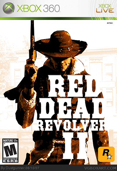
With all the new westerns coming out, I thought it's time to pay tribute to one of my favorites: Red Dead Revolver. This is what I think the second entry in the series should look like.
[ Reply ]
try making the logo black
[ Reply ]
It would become invisible.
[ Reply ]
Great style, nice job.
#2, bad idea.
[ Reply ]
i like how u kept the title within the main character 5/5
[ Reply ]
it's presented well, but the color contrast doesn't really seem to fit. But the style is quiet nice.
[ Reply ]
this might actually look better without the faint background.
[ Reply ]
box updated. everyone tell me if you like this version more. i think this one is more eye-catching, but i appreciate the other's simplicity.
Edited at 1 decade ago
[ Reply ]
i like the look a lot.
[ Reply ]
now this looks like a Red Dead cover, I think it looks much better. A little bright, but still much better.
[ Reply ]
Great job .
[ Reply ]
the logo font looks really good.
[ Reply ]
OH GOD NO!!! PLEASE!! NOT ANOTHER ONE!!! Wait...this isn't GUN? Oh, then it won't suck. BTW- Boxart= 4.5/5
[ Reply ]
I'd like to see you go back and update your old boxes. =D
[ Reply ]