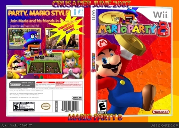
the text at the back is blurry, the "over 50 minigames" looks too much like an advertisement and the front cover has mario and the title crammed to the sides with a giant space to the side. Plus your missing a lot of characters which is what mario party is really all about.
 Mario Party 8 Box Cover Comments
This is my latest and greatest art. I would like to credit KoopaDasher for his awesome template. I hope you all like it!
[ Reply ]
I don't like very well the back. The "over 50 new mini games" logo is allmost elligible. And the front is too simple.
2.5/5
[ Reply ]
the text at the back is blurry, the "over 50 minigames" looks too much like an advertisement and the front cover has mario and the title crammed to the sides with a giant space to the side. Plus your missing a lot of characters which is what mario party is really all about.
[ Reply ]
this looks alright, although the actual game isn't that good.
[ Reply ]
the background gives this way to much color.
[ Reply ]
How the hell did THIS get in my favorites section?!! Oh...sorry CruSadEr. ...While im here I guess all I can say is 4/10
[ Reply ]