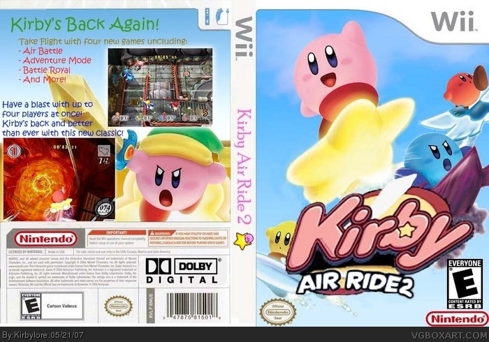
also, the background does make sence, because if you read a little of the back, this Kirby's moving more into the air, so I wanted to feel like you were in the air! weeew!
To be honest, I think it looks amateurish to say the least. Here's some tips that could improve this.
i) I can see jaggies around the characters meaning you wasn't carful enough when cutting. Use an eraser, with a lower hardness, to cut it out.
ii) The main logo is terrible quality and needs a glow or something. I reckon the logo should look something like this link , perhaps with a 2 that you can type and then add a suitable gradient with a black outline to that 2. An easy trick, but it doesn't matter as long as it looks good.
iii) None of the logos are near the exact right size. Use an official box as a guide to help you sort this out.
iv) The text on the back could use some kind of outline or a subtle shadow/glow.
v) The screenies are way too big, shrink them.
vi) In future try looking for high quality pics.
I like the colors of the characters of this box but not much else, I hope you improve.
thanks for your constructive critisism! :D I like that in a post. It's a lot more refreshing than "wow... I just threw up after seeing that" or something... you know what I mean. But yeah... thanks.
The front is pretty good with the exception of your logo...It just doesn't fit in with the quality of the images you have on there. The back is sketchy, mostly because I think you used a bad font. Also, the spine font needs to be changed up. The ESRB logo and the Nintendo Seal need to be switched.
Other than those few things, I really like it. Nice idea.
#16, actually now that I actually read your post all the way through, if you look on the first Kirby Air Ride boxart, you'll see that the dev/ESRB placement is how it is in mine, so thanks for the comment, but your wrong on that one :)
 Kirby Air Ride 2 Box Cover Comments
template cred to "The Employer" on the forums. post your comments!
[ Reply ]
logo is AWFUL, try magnetic lasso tool, background is kinda weird.
back is so non-kirby and the 'kirby air ride 2' , i think, looks better in 1 color.
[ Reply ]
i go with #2 but in a nicer way.
[ Reply ]
I go with #3 in the nicest way.
[ Reply ]
i go with.. ow never mind, im way the meanest xD
[ Reply ]
nd[ srry for double post] im not mean, im trying to be constructive.. it might sound that way. but im just giving tips.
[ Reply ]
how is the back non kirby
[ Reply ]
Just because it's not like the other ones, doesn't mean its bad. It's just different.
[ Reply ]
also, the background does make sence, because if you read a little of the back, this Kirby's moving more into the air, so I wanted to feel like you were in the air! weeew!
[ Reply ]
It's nice and perky, but the Dolby Pro Logie II logo is blur.
3.5/5
[ Reply ]
To be honest, I think it looks amateurish to say the least. Here's some tips that could improve this.
i) I can see jaggies around the characters meaning you wasn't carful enough when cutting. Use an eraser, with a lower hardness, to cut it out.
ii) The main logo is terrible quality and needs a glow or something. I reckon the logo should look something like this link , perhaps with a 2 that you can type and then add a suitable gradient with a black outline to that 2. An easy trick, but it doesn't matter as long as it looks good.
iii) None of the logos are near the exact right size. Use an official box as a guide to help you sort this out.
iv) The text on the back could use some kind of outline or a subtle shadow/glow.
v) The screenies are way too big, shrink them.
vi) In future try looking for high quality pics.
I like the colors of the characters of this box but not much else, I hope you improve.
[ Reply ]
thanks for your constructive critisism! :D I like that in a post. It's a lot more refreshing than "wow... I just threw up after seeing that" or something... you know what I mean. But yeah... thanks.
[ Reply ]
updated!
[ Reply ]
I cleared up the front a ton, re-worked the logo, the side, and put a new dolby logo in the back.
[ Reply ]
i like the front a lot, though. good job ( on the front)( added to favrites because its good(work on the back though) i like it)
Edited at 1 decade ago
[ Reply ]
The front is pretty good with the exception of your logo...It just doesn't fit in with the quality of the images you have on there. The back is sketchy, mostly because I think you used a bad font. Also, the spine font needs to be changed up. The ESRB logo and the Nintendo Seal need to be switched.
Other than those few things, I really like it. Nice idea.
[ Reply ]
#16, actually now that I actually read your post all the way through, if you look on the first Kirby Air Ride boxart, you'll see that the dev/ESRB placement is how it is in mine, so thanks for the comment, but your wrong on that one :)
[ Reply ]
i say good
[ Reply ]