cool bt with the reflection add a layer mask to it get out your FG to transparent tool and drag it from the bottom of the reflection to the top it will make it look a bit better
Ingame Screenshots should never be used for the front. Never high a good enough quality. They can, however, be used for the back, but only if they are high res and of good quality.
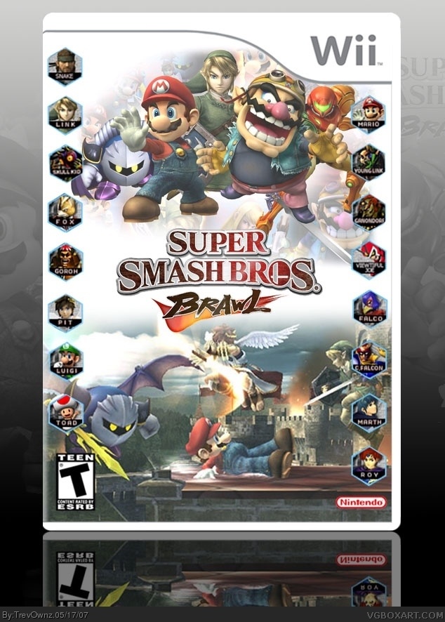
i got the people things from a huge character select that was thought to be the new line up for characters. sorry if there is someone that is no longer in the game, i tried to make sure they were in the old one or said to be in the new one.
#19, Trevownz change the background picture from that old logo to new power up thing that they grab to do he special moves and this would be HOF material
 Super Smash Bros. Brawl Box Cover Comments
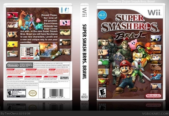
I made this at school and fixed it up some at home.
hope you like it.
[ Reply ]
looks good, has its own kind f thing going for it. 5/5
[ Reply ]
cool bt with the reflection add a layer mask to it get out your FG to transparent tool and drag it from the bottom of the reflection to the top it will make it look a bit better
[ Reply ]
i like the characters on the sides but you really need to emphasis the top half or the bottom half, meaning you should just drop one of them.
[ Reply ]
very nice i like it allot 10/10 looks official
[ Reply ]
REally nice! the only thing is that the main logo should be bigger. 5/5
[ Reply ]
#5, agreed
[ Reply ]
It resembles the Melee box. i like it. 10/10.
[ Reply ]
thanks everyone =]
[ Reply ]
i like it very much!! the only thing i thing is strange is you used a in game shot in the bottom, and thats a bit strange for me!! so 4.5/5
[ Reply ]
Looks very nice, keep it up.
[ Reply ]
Ingame Screenshots should never be used for the front. Never high a good enough quality. They can, however, be used for the back, but only if they are high res and of good quality.
I like this.
[ Reply ]
well i think it looks tight.
[ Reply ]
its good but it has been confirmed there will be no young link.
(or dr. mario)
[ Reply ]
#14, Do you have a Link ?
[ Reply ]
yes there is 2 one on both sides.
i got the people things from a huge character select that was thought to be the new line up for characters. sorry if there is someone that is no longer in the game, i tried to make sure they were in the old one or said to be in the new one.
[ Reply ]
Totally amazing! How did you do it?
[ Reply ]
This is so good.
WHy is it not in HOF?
5/5
[ Reply ]
best super smash box EVER!!!
[ Reply ]
#19, Trevownz change the background picture from that old logo to new power up thing that they grab to do he special moves and this would be HOF material
[ Reply ]
this is terrible! you dont understand how bad you are at box art!!!!!
just kidding this rocks! 5/5 HOF materisl!
Edited at 1 decade ago
[ Reply ]
VERSION 3
On this one i spent a great deal of time rendering all these characters and making the new template for it sooo
Tell me what you think?
[ Reply ]
It must be my birthday.
[ Reply ]
woah it's completely different now.
still not bad.
[ Reply ]
Thanks guys.
[ Reply ]
this one is awsome
5/5 + FAV
[ Reply ]
I just dislike showing devil and groudons and knuckle joes faces whit all the character faces...
great anyway.
#28, youre right.
Edited at 1 decade ago
[ Reply ]
erm Fox doesn't look like that in Brawl...
[ Reply ]
New template i made, temp idea from KD. New backgrounds on all my boxes.
Thanks for looking.
Edited at 1 decade ago
[ Reply ]
I was looking at the older versions and the 1st and 2nd ones look different from the 3rd and 4th, but this still deserves a fav
[ Reply ]